Founder of an EdTech startup
🗓️
34 years old
👩💻
Tech Fluency: Low to Moderate
🇦🇪
Dubai, UAE
🎯 Goals:
Automate internal support and employee onboarding.
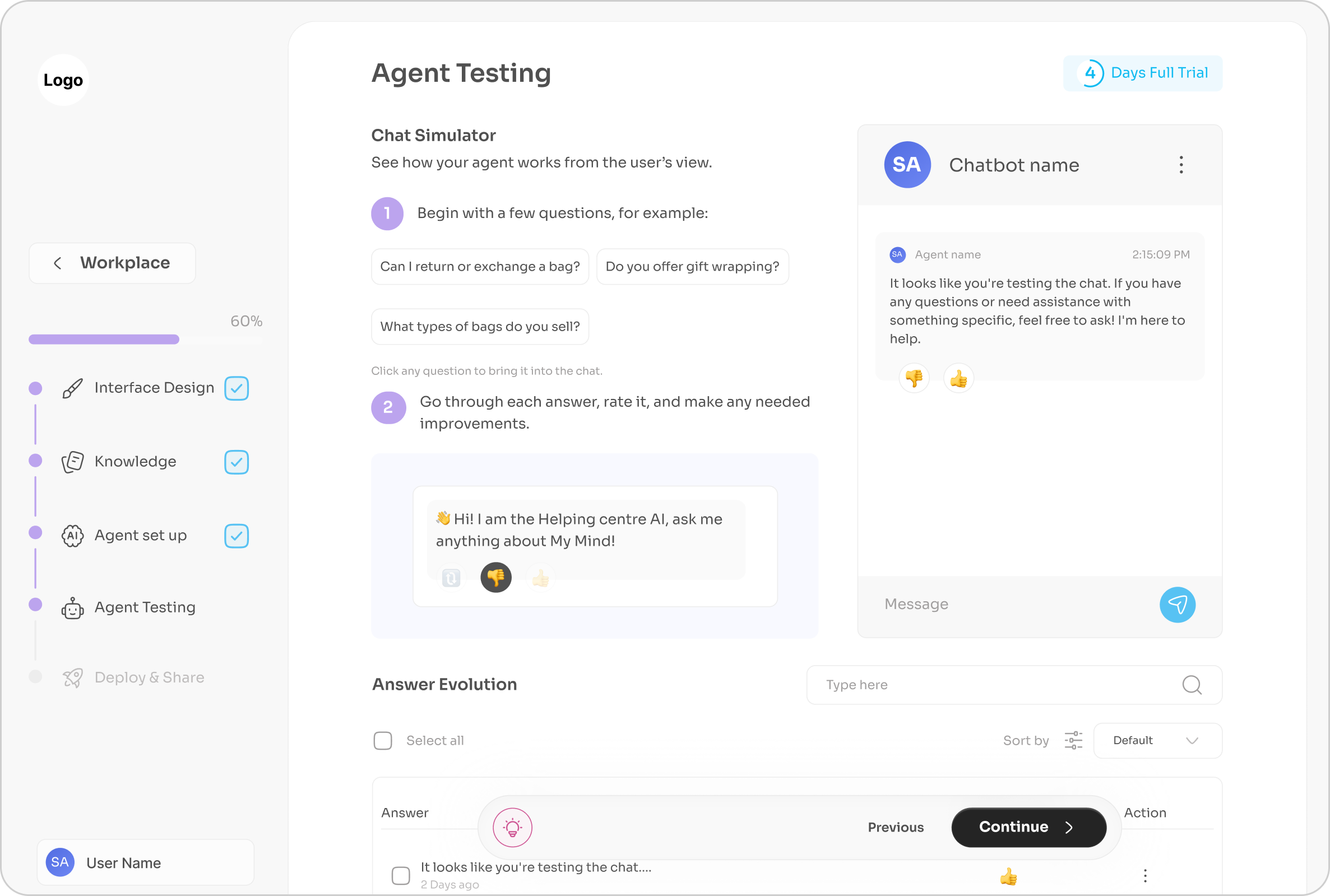
Maintain accurate, up-to-date responses by training the chatbot on internal documents and monitoring unanswered questions.
Provide 24/7 access to company knowledge and policies.
❌ Pain Points:
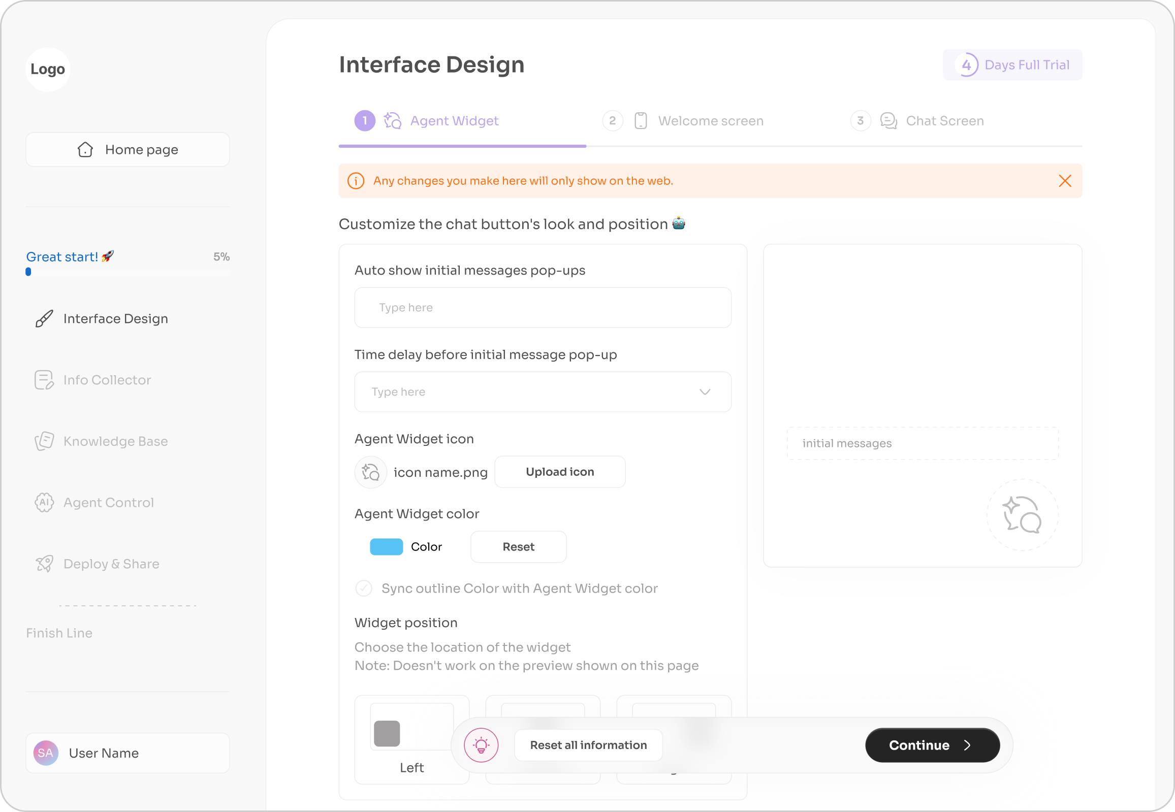
Difficulty setting up bots without technical skills.
Lack of content control, approval workflows, and version tracking.
Concerns around security, access permissions, and compliance.
🧩 Needs:
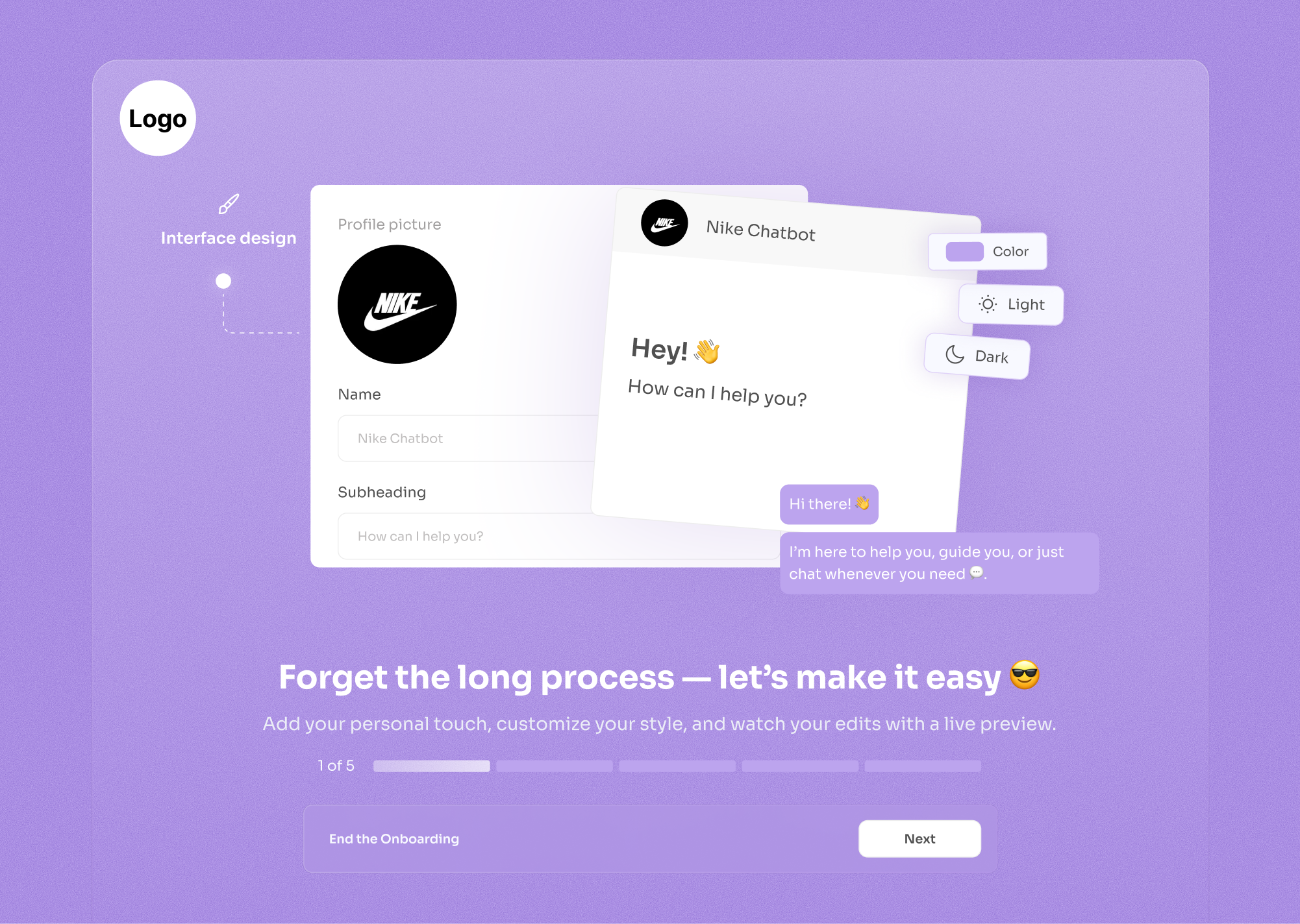
A simple onboarding setup (wizard-style) to upload and configure knowledge sources..
Pre-built templates for common use cases like FAQs or course assistants.
Clear pricing explanation and support content.

Product Manager
🗓️
41 years old
👩💻
Tech Fluency: High
🇩🇪
Berlin, Germany
🎯 Goals:
Automate onboarding and reduce support tickets
Train chatbot on product documentation
Monitor unanswered questions, improve over time
❌ Pain Points:
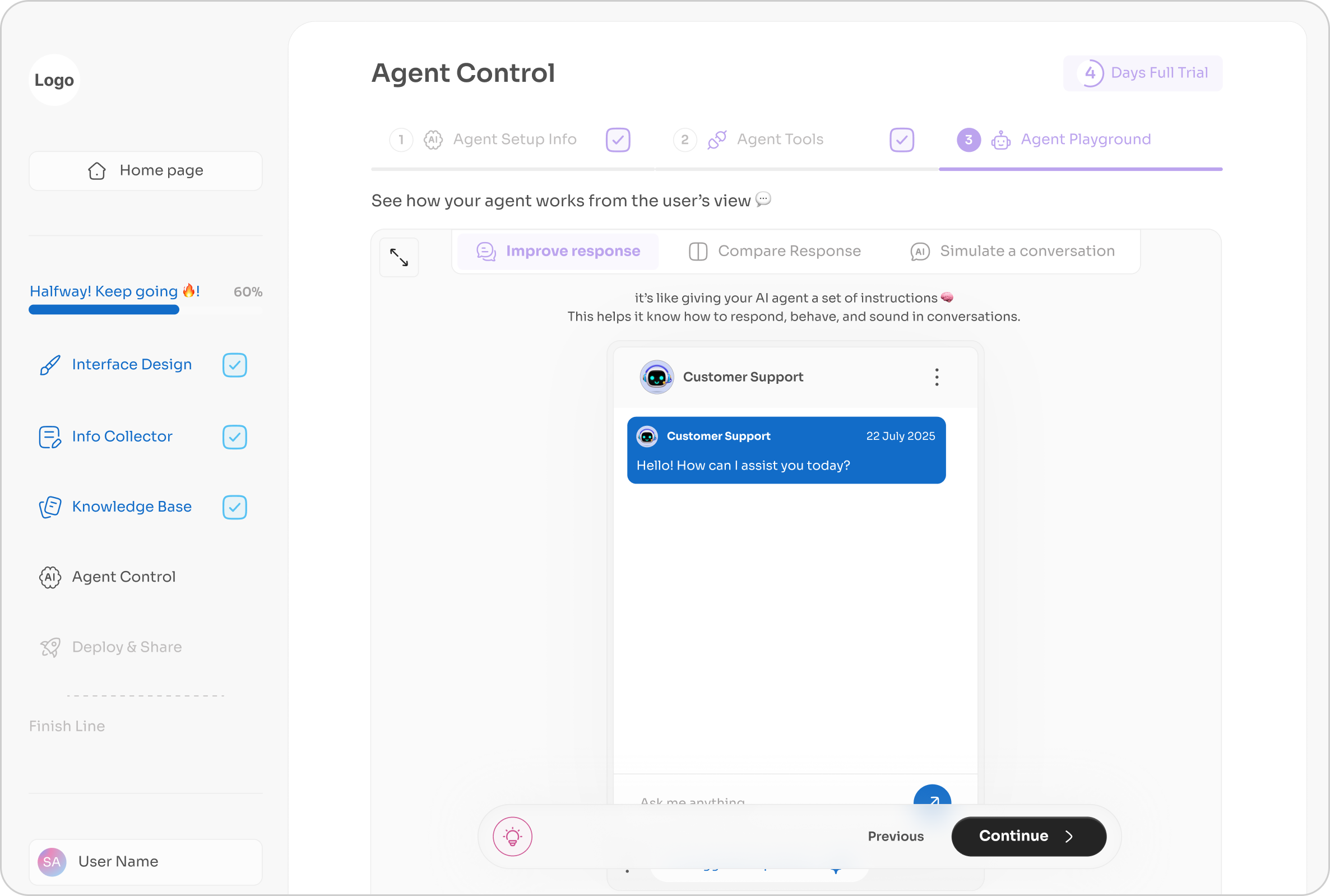
Frustrated with lack of analytics or control
Wants version history of knowledge base sync
Seeks compliance clarity (GDPR, data privacy)
🧩 Needs:
Bot performance insights (charts, query logs)
Integration with internal docs & analytics tools
Admin controls and bot versioning

Developer
🗓️
27 years old
👩💻
Tech Fluency: Advance
🇸🇦
Riyadh, Saudi Arabia
🎯 Goals:
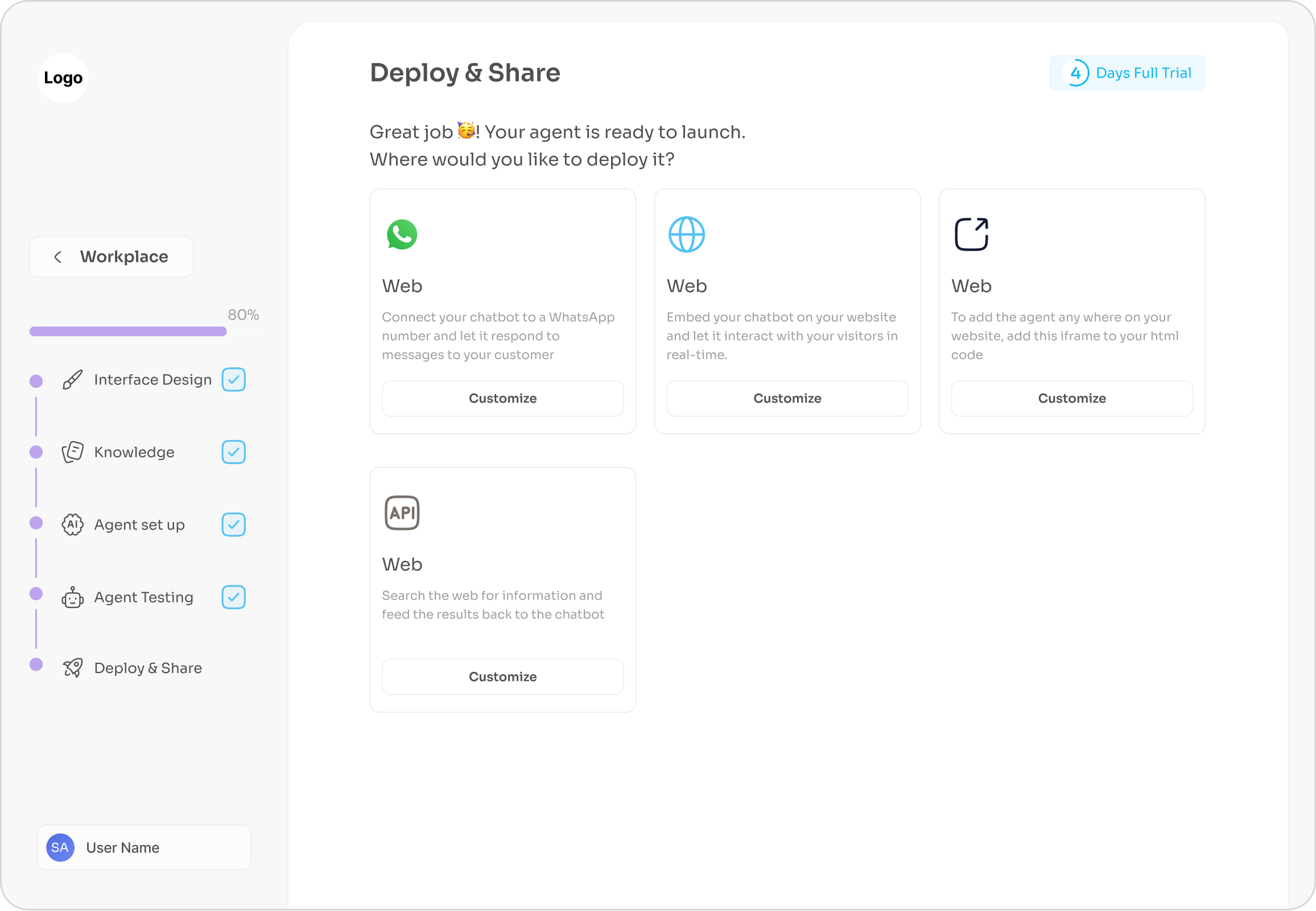
Embed bots into Webflow, WordPress, or React apps
Offer AI chatbot as a value-add to his services
Monitor unanswered questions, improve over time
❌ Pain Points:
Frustrated with lack of analytics or control
Wants version history of knowledge base sync
Seeks compliance clarity (GDPR, data privacy)
🧩 Needs:
Easy-to-use API access and clear docs
Manage multiple chat bots for different clients
Simple way to customize embed code