


About Sayyar

Paragraph 3


In this project, I acted as a Product Designer, starting by collecting data through interviews with employees from Awqaf to understand their actual needs. The research journey was fascinating, as we were designing a product that would be used daily by the team.
Usability sessions were crucial to ensure the product helped users stay engaged and made it easy to share innovative ideas, keeping the journey smooth and intuitive.
The journey is structured in four stages:
User Research → Insights Gathering → Usability Testing → Design Refinement → Implementation
The outcome made the journey meaningful for me, and I hope it feels the same to you. ✨
Hope you enjoy this ✈️
Timeline
2022/23 - 1 Year
Team
PM + 2 Designers
Scope
Product Discovery • UX Strategy • End-to-End Product Design
Awqaf believed that the best solutions come from those who experience the challenges firsthand, "He who feels it, knows it."
By listening to employees' daily experiences, the team uncovered recurring pain points that existing systems failed to address. These insights became the foundation for designing a solution that met real needs and enabled meaningful organizational change.


Read more


Usability session 1

Insights
Our aha moment: 90% of users want copyright protection, a clear sign that providing these resources will build even stronger trust.
Usability issue
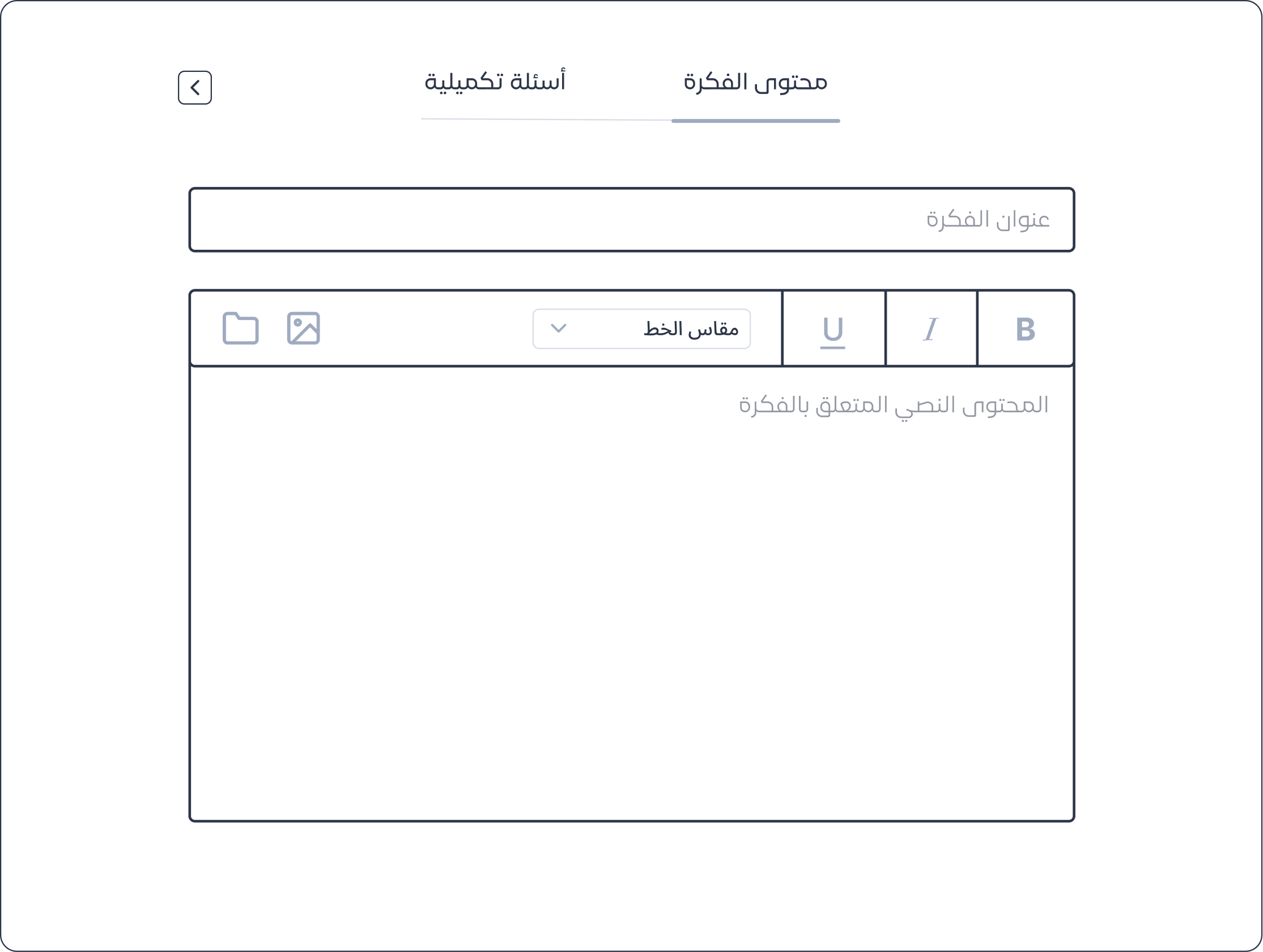
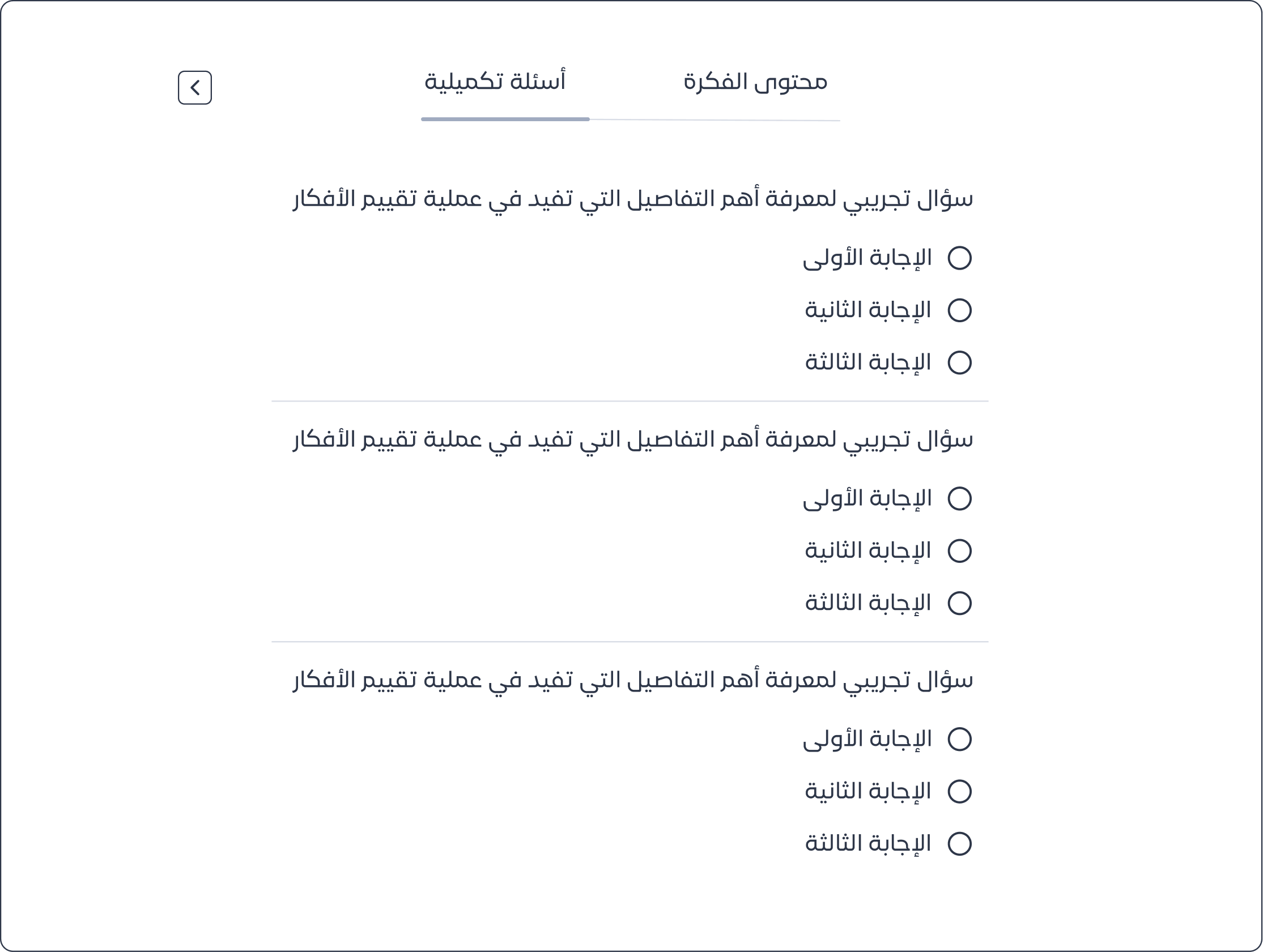
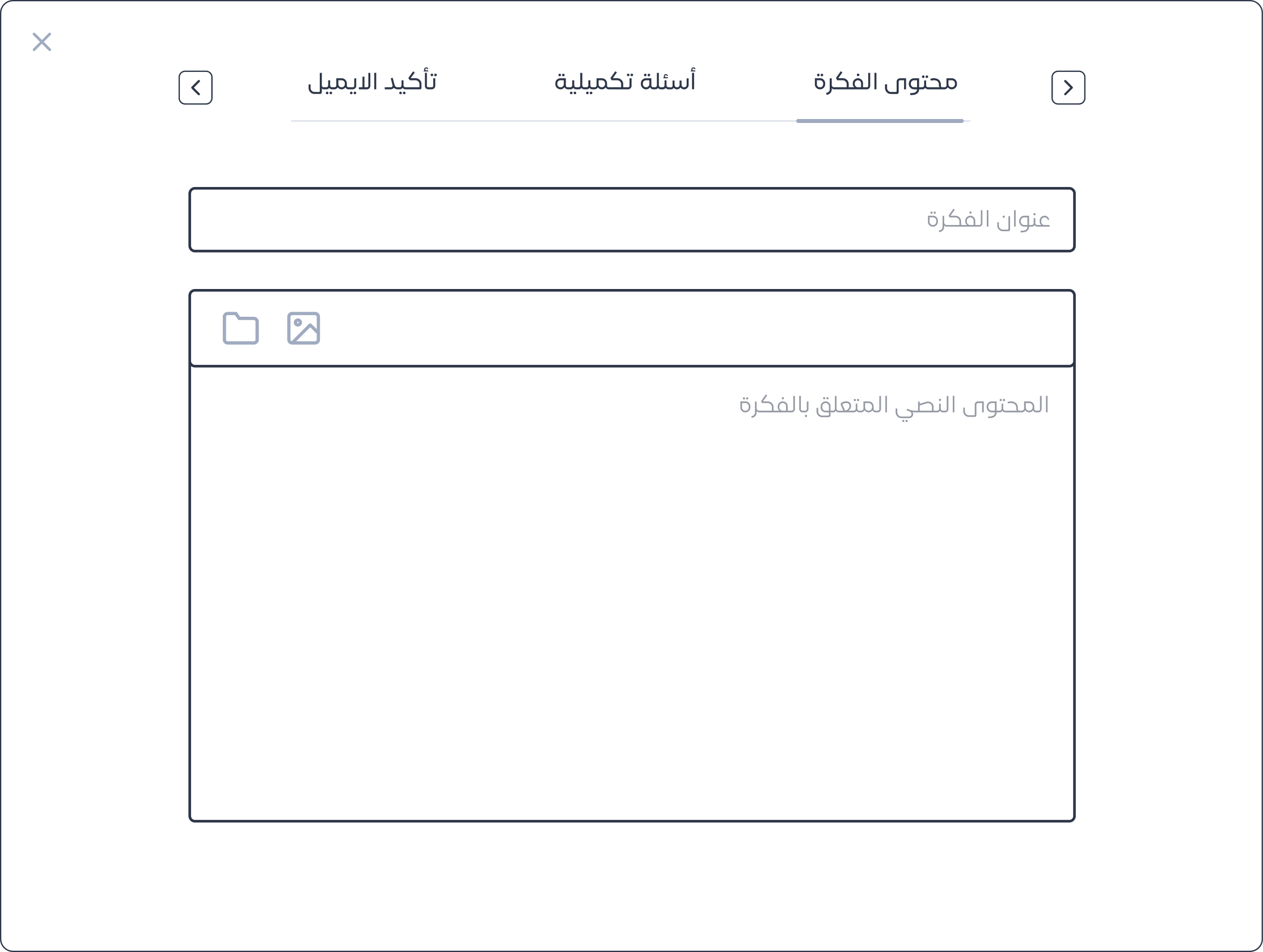
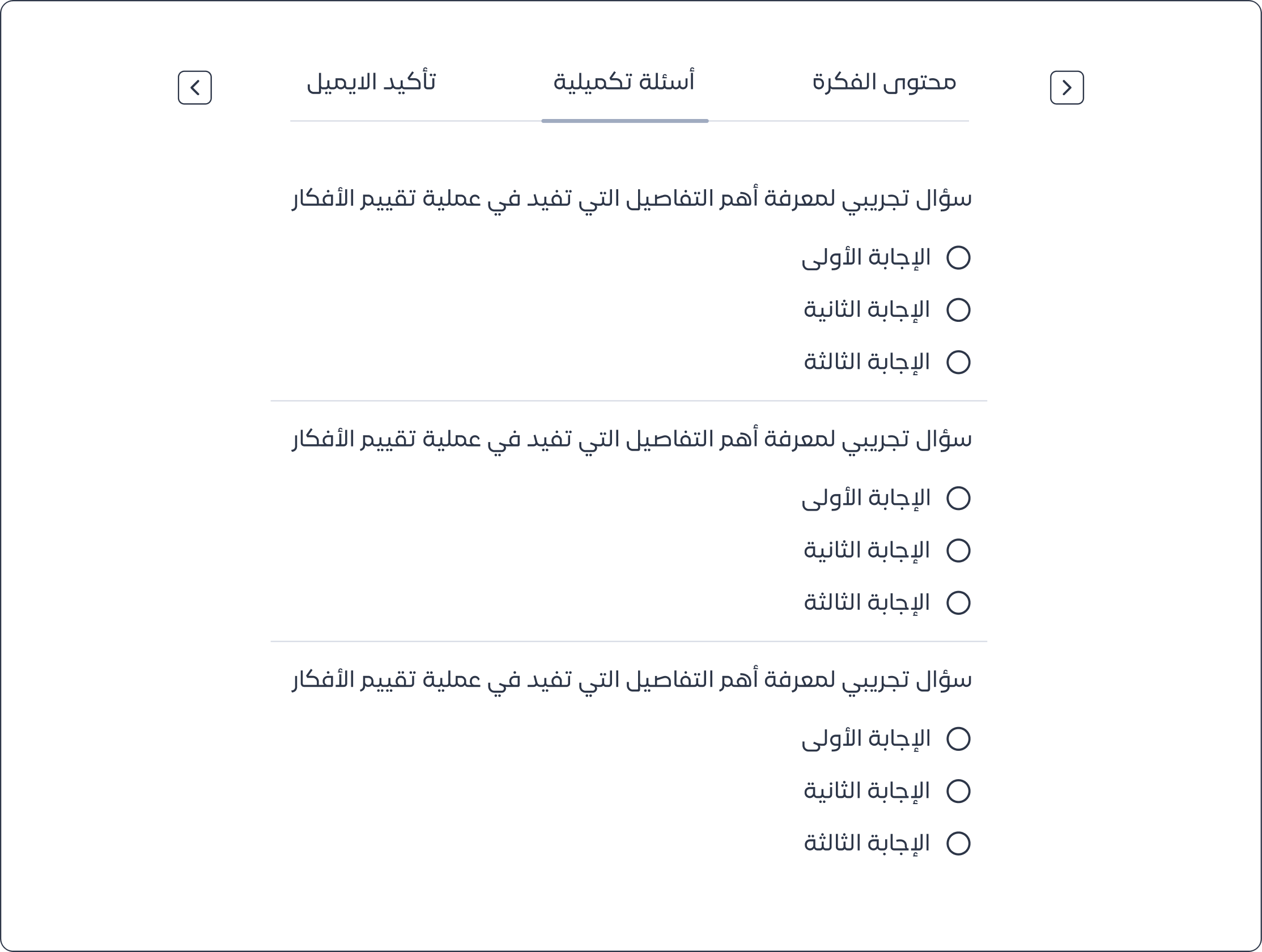
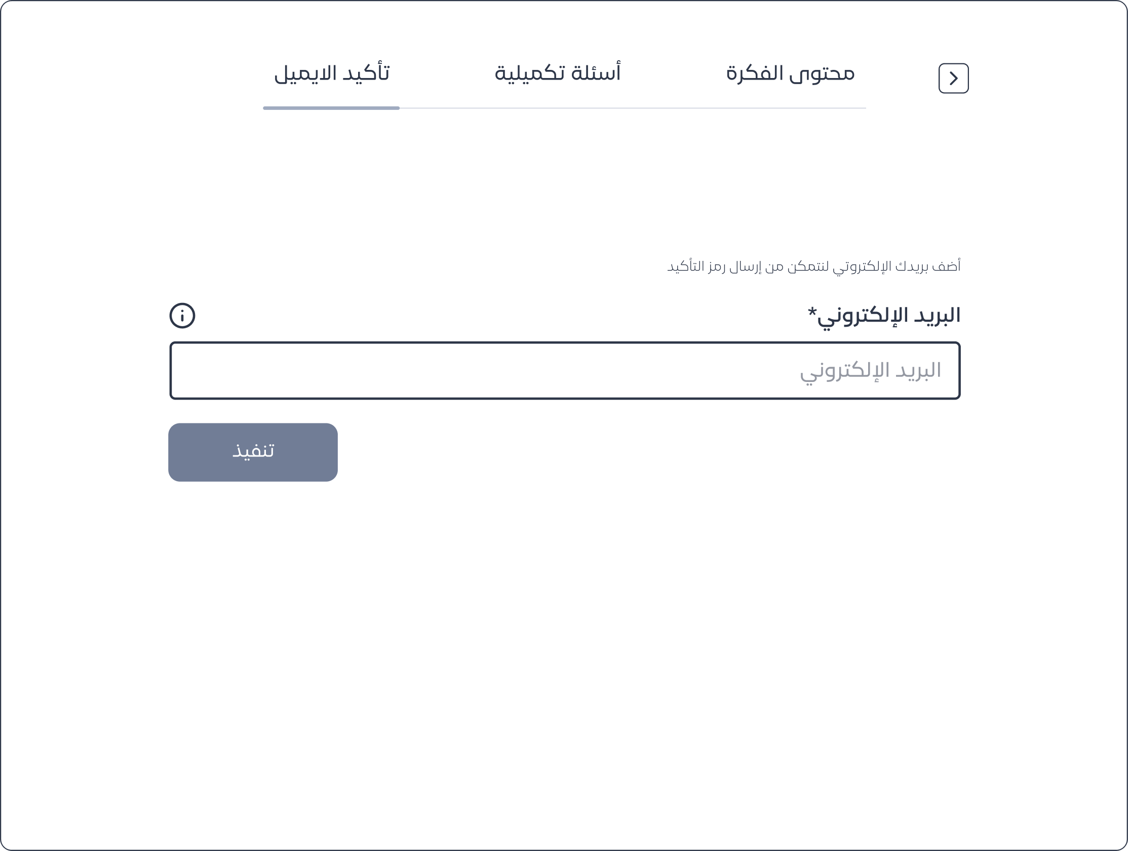
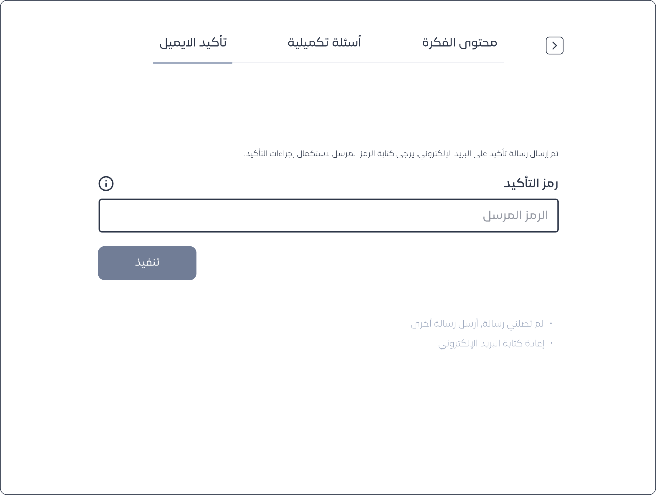
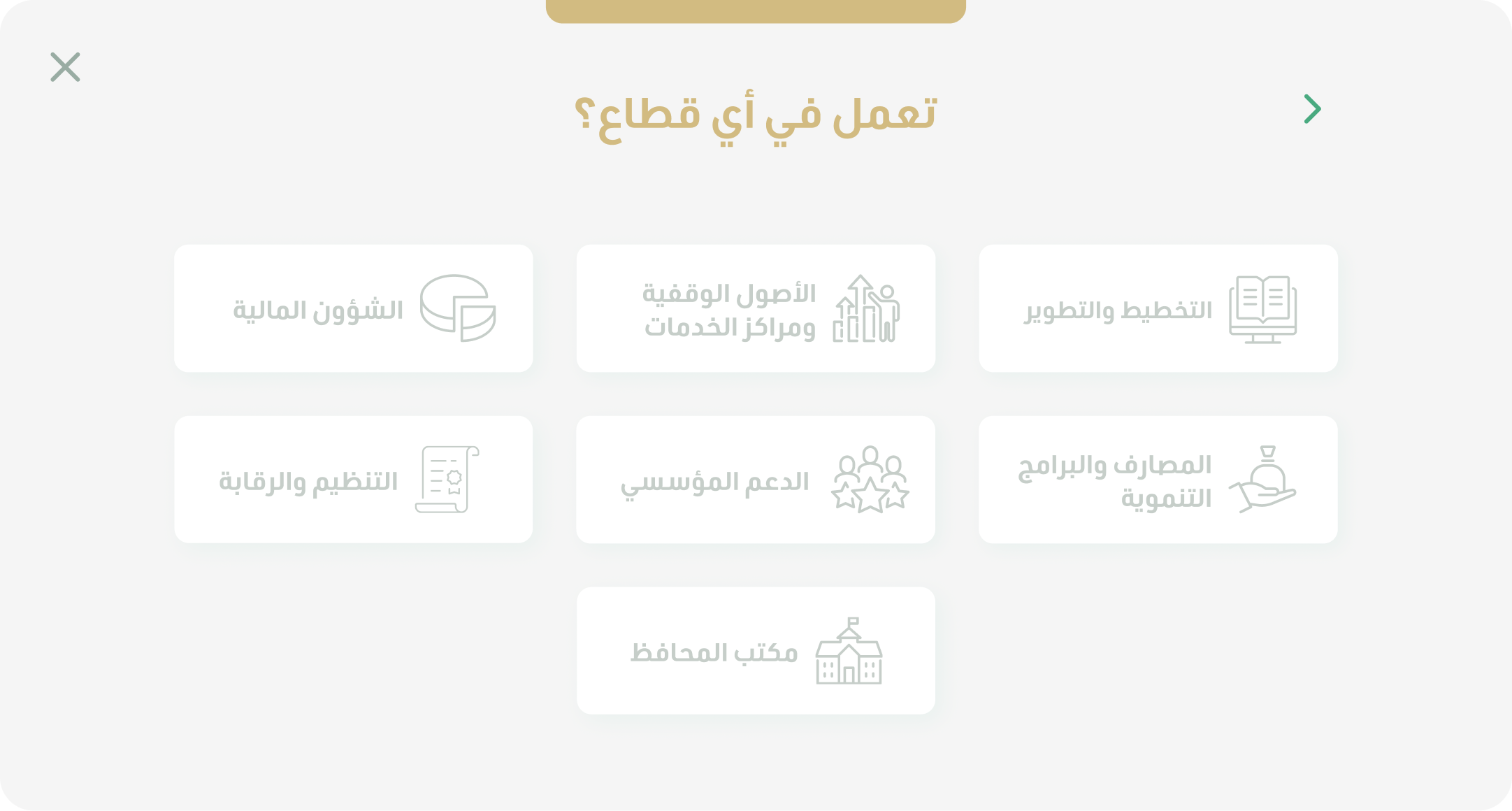
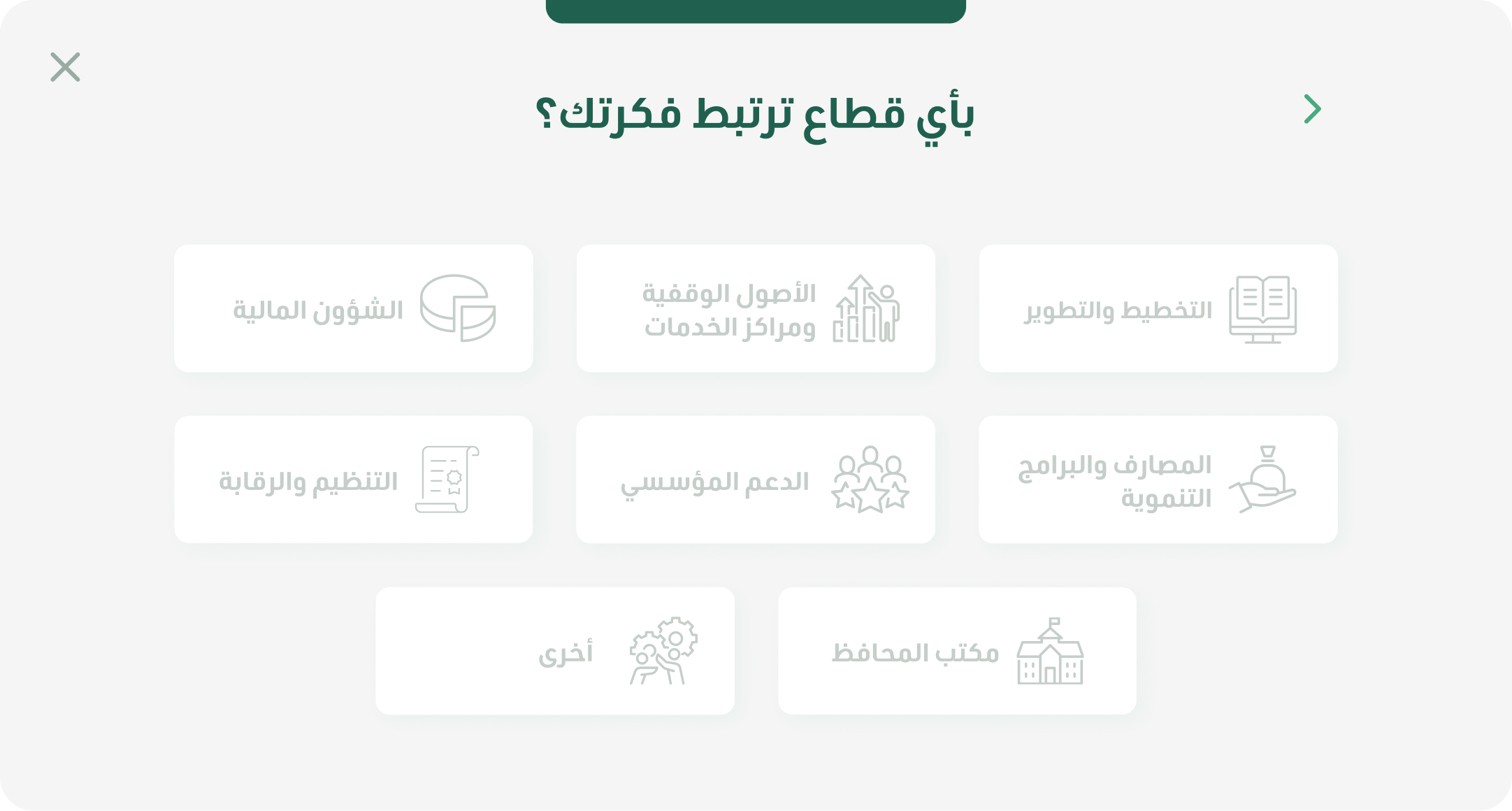
In the first phase, we split the process into two stages. Users start by adding their idea’s content, then answer a set of questions that explain the idea and its value to employees.
Usability session 2
Usability issue
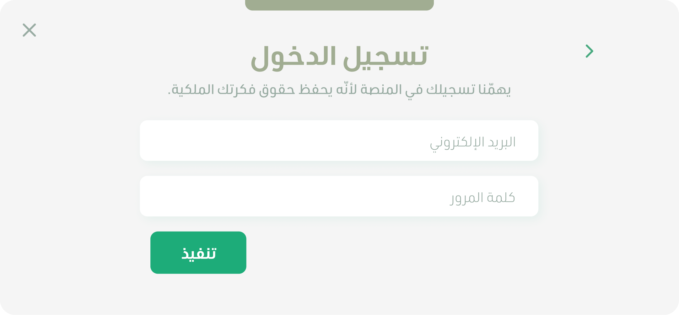
To strengthen idea protection, we added a registration feature that securely attributes each idea to its rightful owner. Users maintain complete control, with the flexibility to delete, edit, or enhance their ideas.
Insights
Not all users complete the flow or take the time to provide experts with detailed information about their ideas. Even when they say the process isn’t boring, their behavior shows they’re busy and quickly lose interest.
Usability session 3
Solution
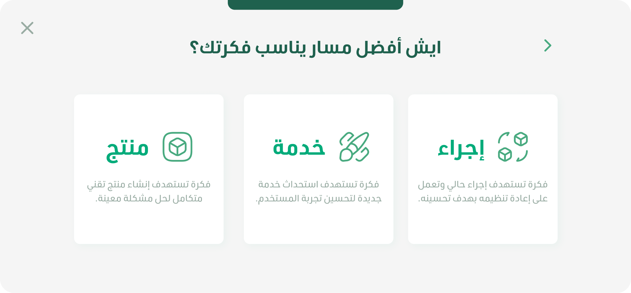
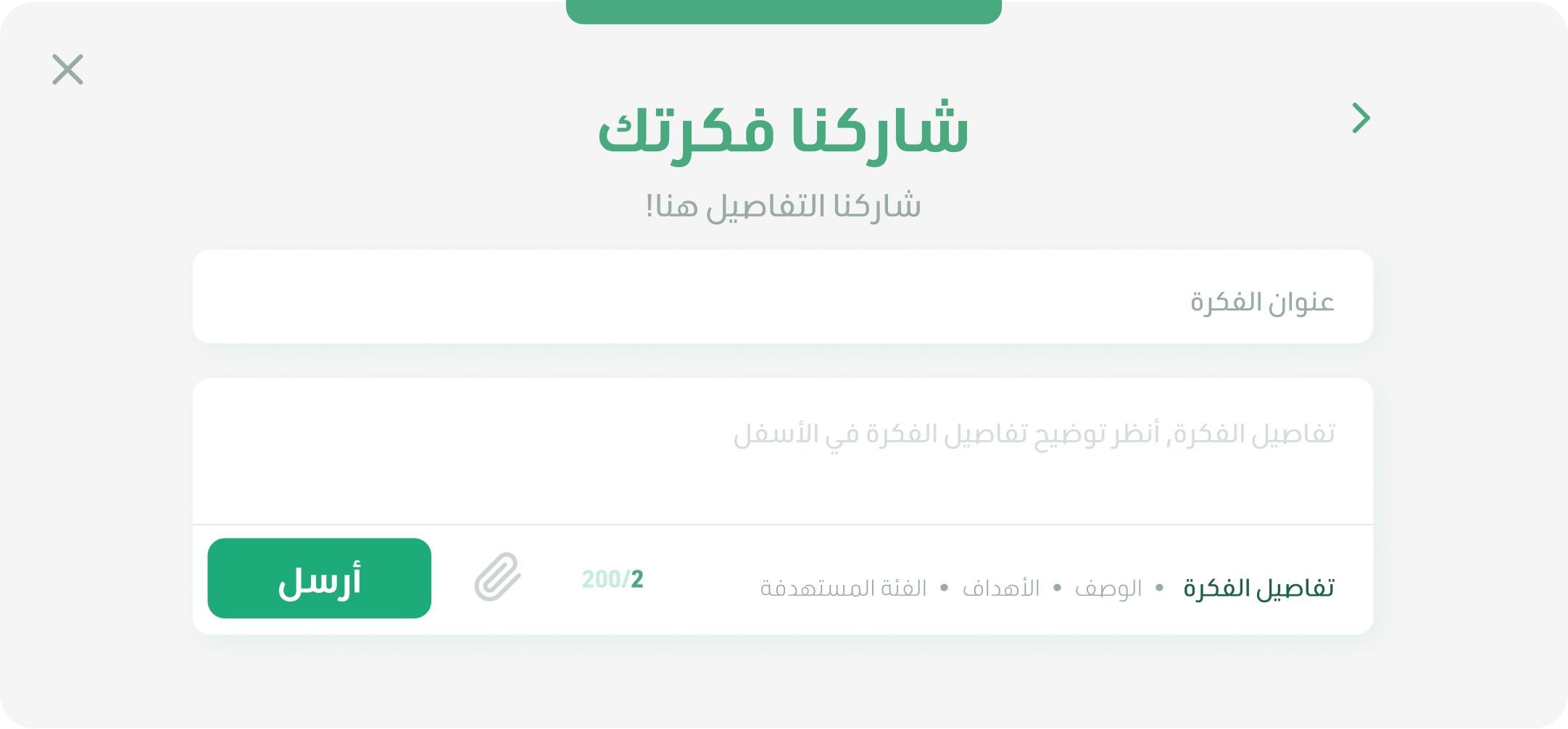
By redesigning the idea submission journey into four clear steps, identifying the user’s division, defining the idea’s type and impact, providing a guided space with helpful hints, and confirming successful registration, we’ve created a flow that users find intuitive, engaging, and effortless.The addition of clear, simple language and joyful interactions ensures ideas are submitted fully and confidently, driving higher participation and richer insights.


Usability session 2
Insights
After consistent use, we noticed that some users want more engagement with experts and reminders to complete workshops.
Solution
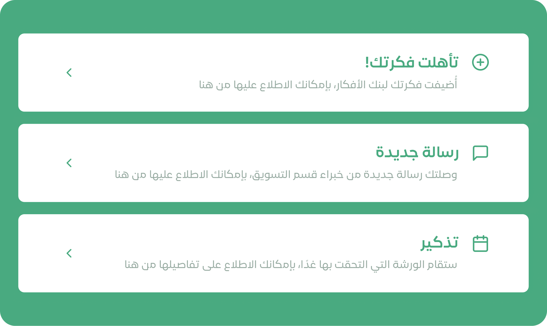
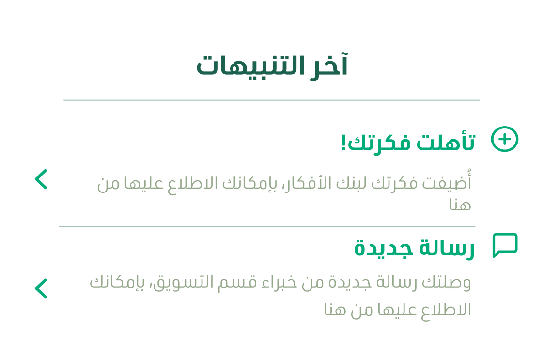
Adding platform and email notifications to inform users about expert interactions, idea status, and workshop reminders can make engagement and task completion easier while keeping users supported.

Usability session 1
Insights
After noticing that users found lengthy idea briefs boring and time-consuming, we asked: What do users want to read, and how do they want to read it?
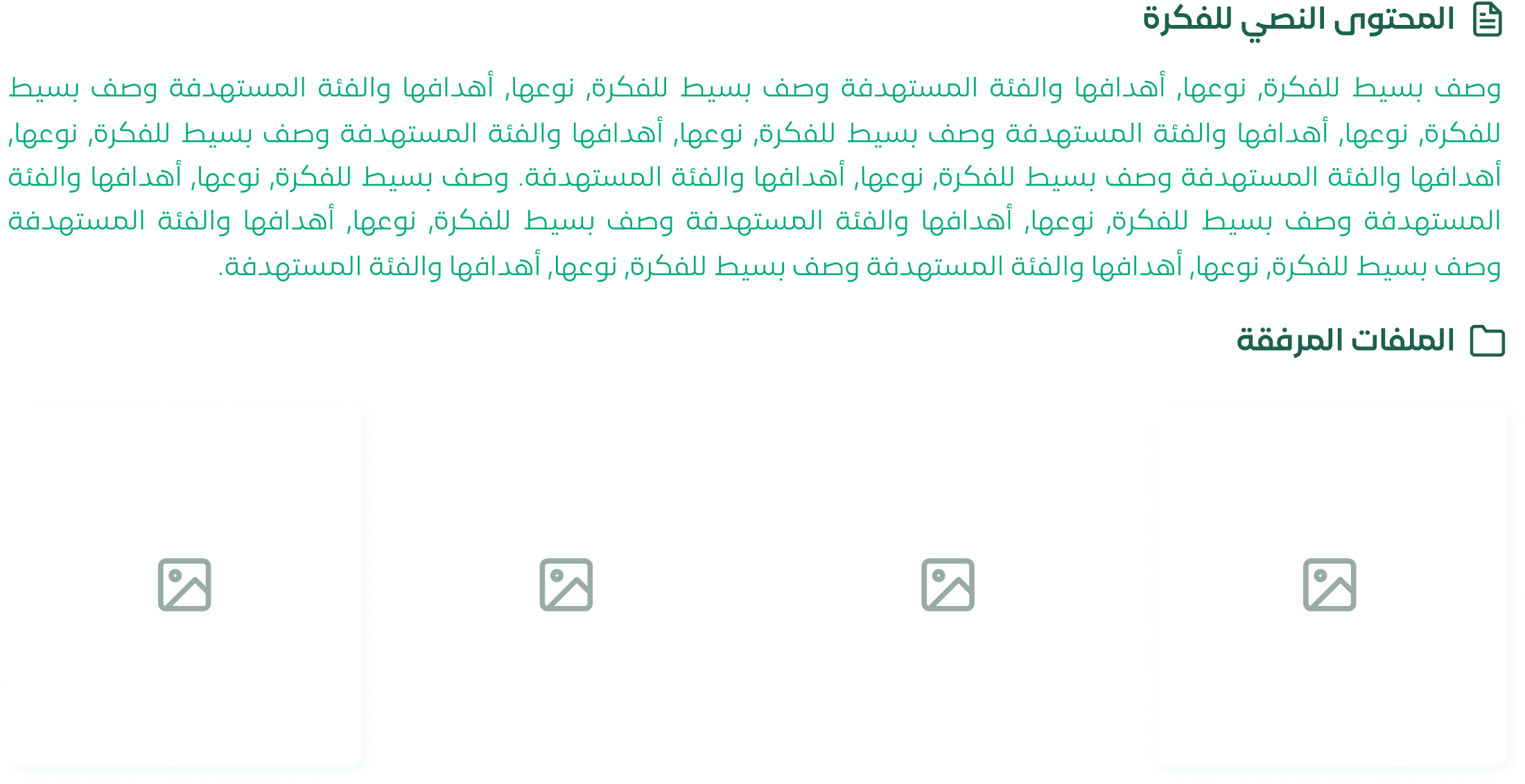
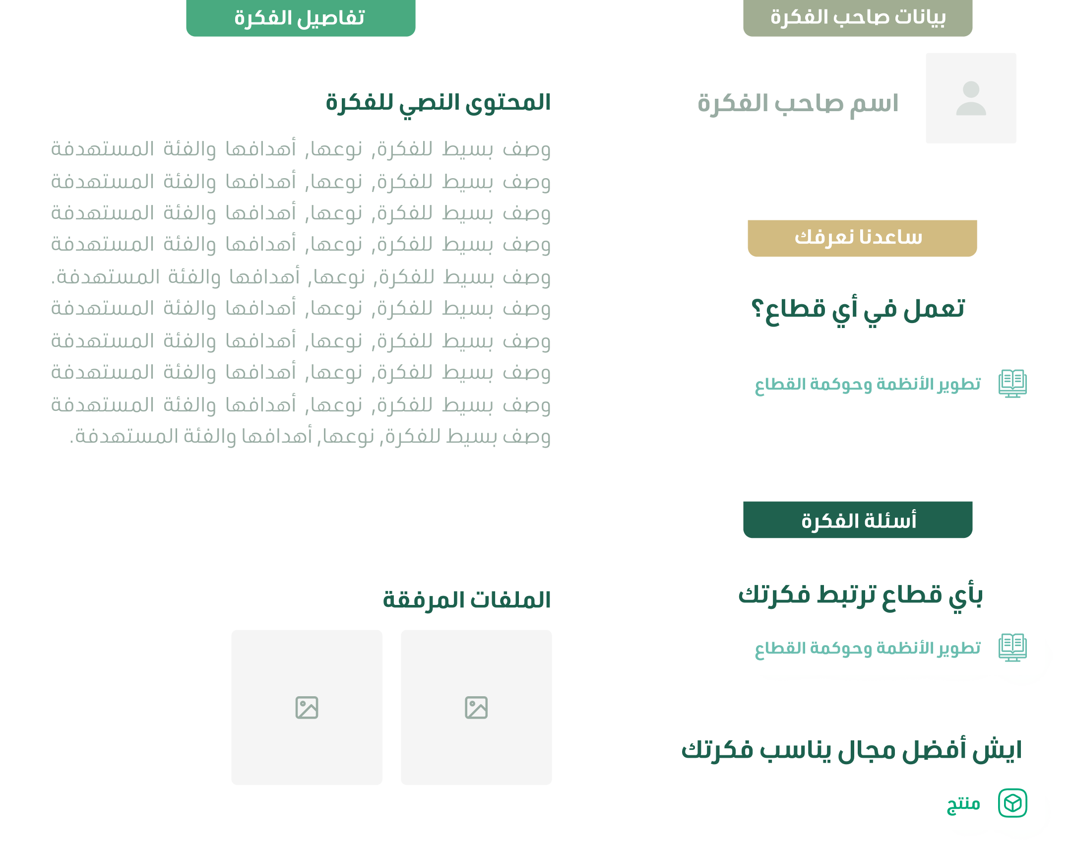
Reorganized the idea area based on the submission structure and added color coding for each section according to idea submission categories, improving readability and making it easier for users to scan content.


Knowledge Center

Ideas Bank

Ideas Bank


#D2BB81

#1DAC79

#6BBCAD

#95A78B


Building Bridges

Ideas Sparks in My Conception

Our Door to Better Experiences

"He who feels it, knows it"


