Insights 📝
Users get lost between adding items and completing payment, unsure of next steps or what's required.
Problem Statement ❌
The checkout process feels longer and slower than expected, leading to frustration at a critical moment. Users want quick, confident purchasing without unnecessary steps.
How might we ⁉️
Simplify checkout to make it as fast and seamless as possible while giving users control over their purchase journey?
Opportunities 💡
Provide multiple purchase paths for different user needs
Make product customization visible and accessible upfront
Show clear value proposition at the moment of purchase
Insights 📝
Treasure Hunt Frustration - Users struggle to locate categories, features, or cards
The Endless Scroll - Users need better filtering/search to find what they want
Problem Statement ❌
Users struggle to find categories, filters, and card types, making discovery feel frustrating and time-consuming.
How might we ⁉️
Make navigation and search more intuitive so users can quickly find what they're looking for?
Opportunities 💡
Implement smart filtering by category or brand
Add search suggestions or autocomplete
Highlight popular or recommended cards
Improve search functionality, category visibility, and filtering options
Insights 📝
Language and cultural mismatch, forced sign up, and limited country support block exploration and signal from the first moment that the app isn’t built for them, driving early abandonment.
Problem Statement ❌
The onboarding experience creates barriers instead of bridges: users from different cultures don't feel welcomed, forced registration blocks exploration, and limited country support excludes international users all contributing to high abandonment during critical first impressions.
How might we ⁉️
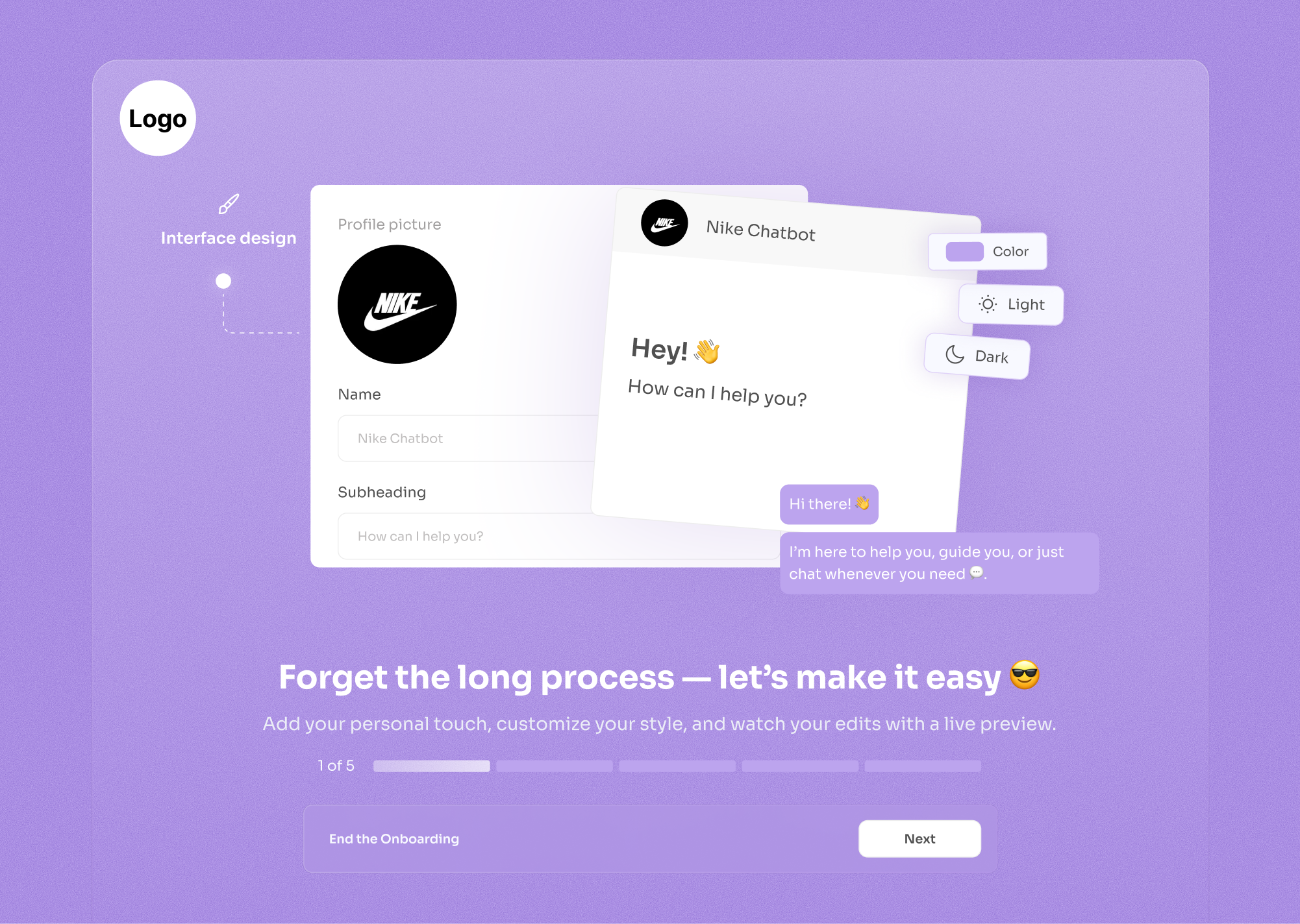
Create an inclusive, low-pressure onboarding experience that welcomes users from any culture, respects their desire to explore first, and supports registration from anywhere in the world?
Opportunities 💡
Make the first experience engaging and culturally relevant
Remove forced commitment during initial experience
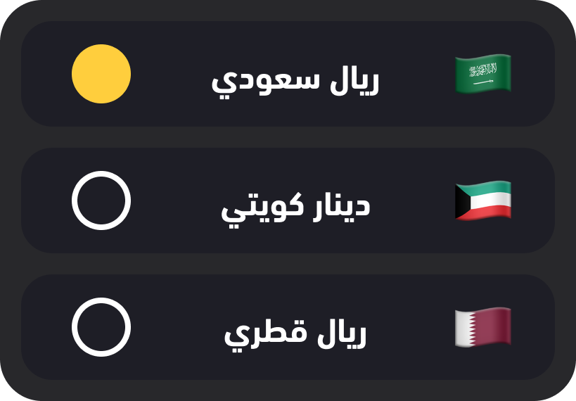
Support global users with proper localization
Insights 📝
Users hesitate to purchase due to limited social proof, unclear product usage, and uncertainty about what happens after purchase. Missing guidance, confirmation, and accessible support create anxiety at every decision point.
Problem Statement ❌
Users lack confidence at key moments: they question product quality without validation, feel unsure how to use or activate products, and don’t know if their actions were successful. Complex language and missing feedback amplify uncertainty and slow decision-making.
How might we ⁉️
How might we build confidence across the journey through social proof, clear guidance, simple language, accessible support, and reassuring confirmation at every step?
Opportunities 💡
Provide social proof and usage clarity to build purchase confidence
Create accessible channels for user input and suggestions
Guide users through post-purchase activation process
Confirmation feedback at every interaction point
Insights 📝
Users admire the clean, modern design but struggle with inconsistent visuals, low contrast, and unclear actions. Without a systematic design approach, the interface looks appealing yet becomes difficult to use, especially across devices and diverse user abilities.
Problem Statement ❌
Despite liking the aesthetic, users face confusion from inconsistent buttons and icons, poor contrast, limited responsiveness, excessive colors, and text heavy layouts. These issues reduce clarity and accessibility, turning visual appeal into a usability barrier.
How might we ⁉️
How might we preserve a modern, minimal look while improving consistency, clarity, and accessibility across devices and user abilities through a systematic design approach?
Opportunities 💡
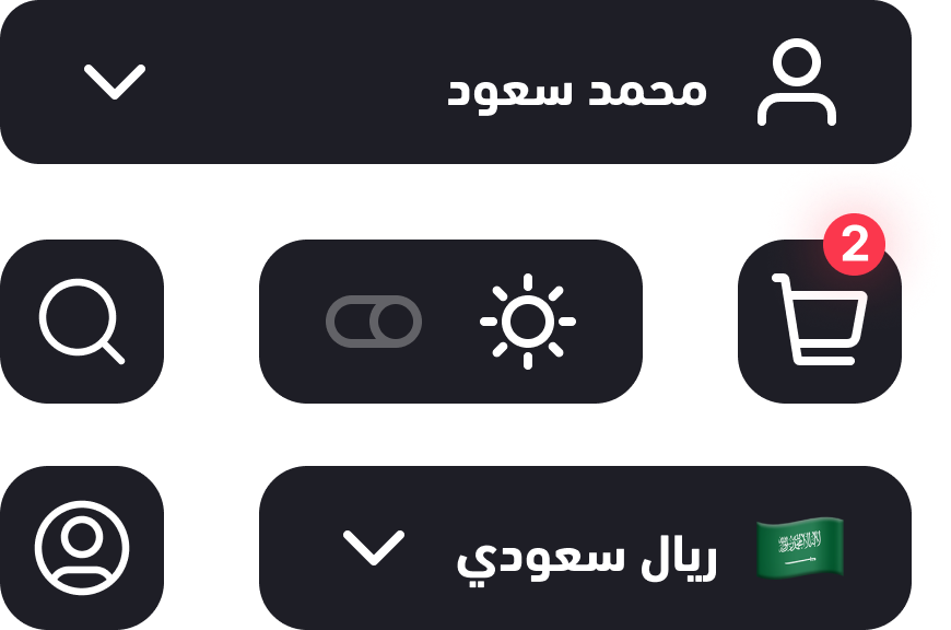
Create systematic consistency for all interactive elements
Improve readability and visual separation
Create focused visual language through intentional color usage
Create universal visual language that transcends language barriers
Making idea creation simple was our hardest task. With the right questions and focused design sessions, we built a flow everyone can use with ease.
100%
1m 20s
Making idea creation simple was our hardest task. With the right questions and focused design sessions, we built a flow everyone can use with ease.
56%
2m 35s
The challenge in choosing cards was that I first asked users to browse the cards freely, then to find a specific card like PUBG or Shein. Since no filtering options existed, users felt overwhelmed, endlessly scrolling up and down without easily locating the card.
96%
2m 2s


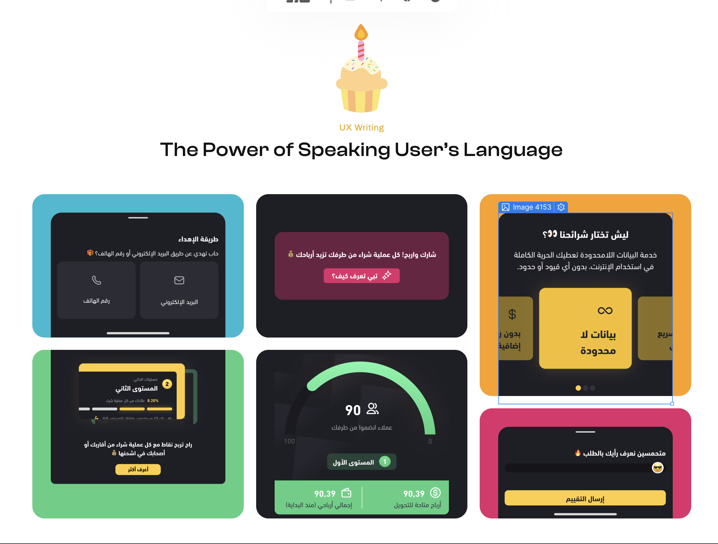
In this project, I served as the Lead UX Designer, shaping the product experience from research to final validation while also contributing to the visual design.
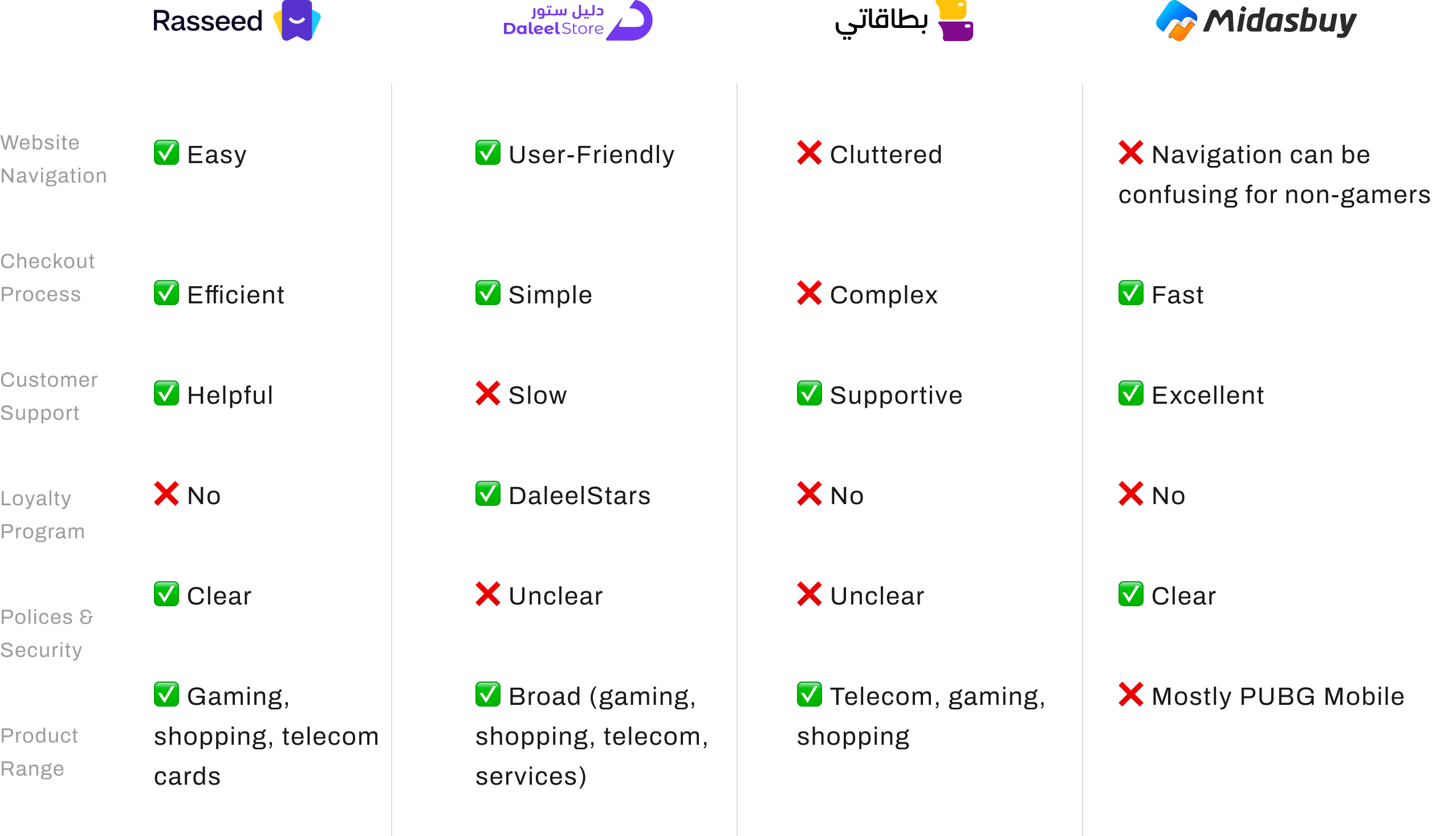
I led the UX process by conducting user interviews, benchmarking competitors, creating personas, improving user journeys, and reframing the experience based on user insights. I also refined the product's UX writing, expanded the brand color system, and measured the impact of the final solution.
The journey is structured in four stages:
Research & Discovery → UX Strategy → Design Execution → Testing & Impact
Each stage demonstrates how research informed decisions, how the experience evolved through iteration, and how the final design delivered measurable improvements.
Hope you enjoy this ✈️
Timeline
2023/24 - 7 Months
Team
PM + 1 Designers + 3 Developer
Scope
User Interviews • User Journey Mapping • UX Strategy • UX Writing • Brand System Expansion • Impact Measurement
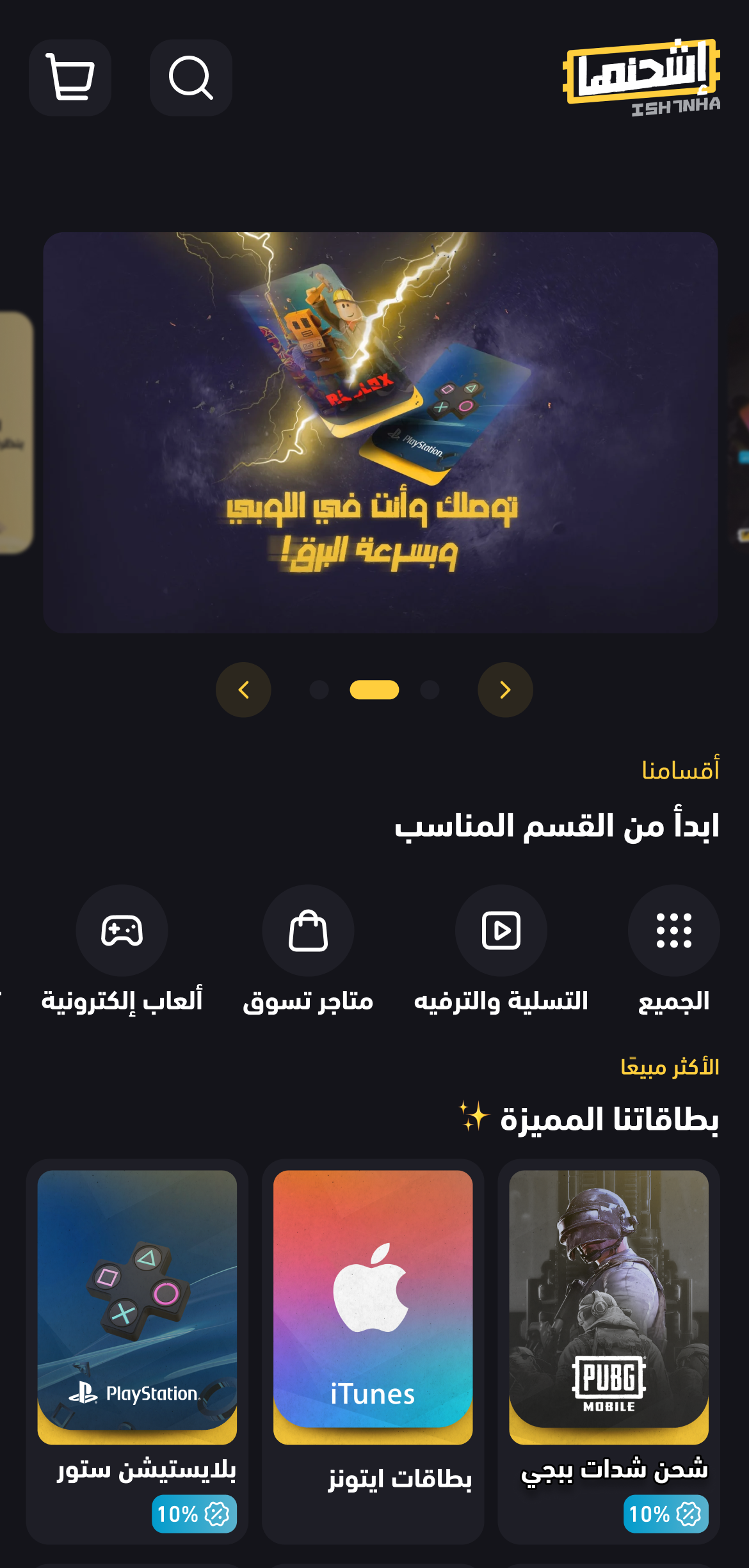
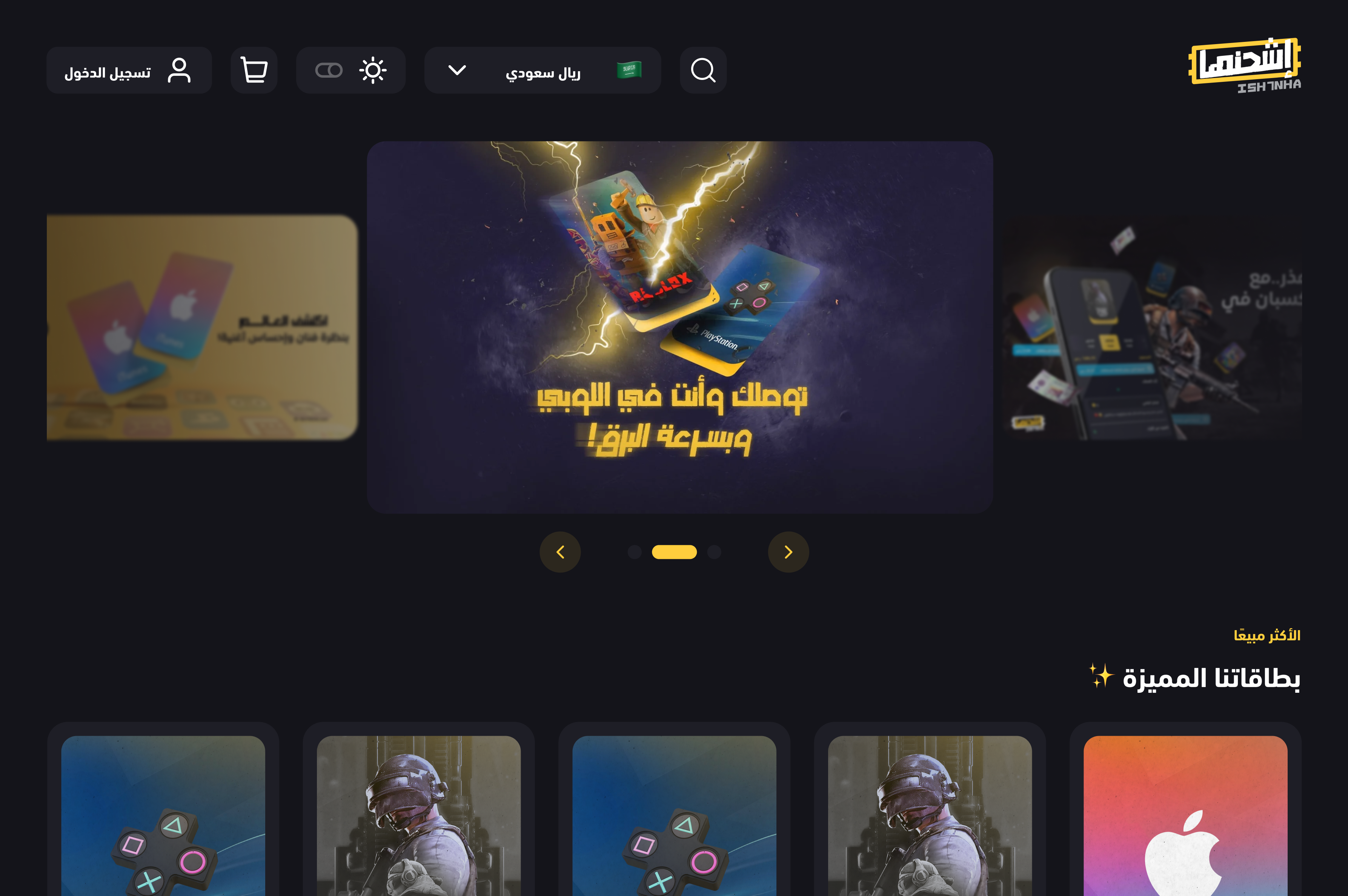
Ish7nha had earned users' trust through years of innovation and unique features. But as the platform grew, navigation became more complex, important features became harder to find, and the experience no longer felt as effortless as it once did.
Read more
Read more
Read more

Read more
Key Advantages
Eliminates blank search anxiety: Users always see where they can go
Reduces decision fatigue: System suggests categories instead of requiring users to remember them
Instant access: One click to any category
Discovery-driven: shows users categories they didn't know existed
Measurable Outcomes
38% of users click rotating suggestions to explore new categories
Navigation time reduced from 45s to 12s for suggested categories
Category discovery increased by 52% (users finding categories they didn't search for)
Key Advantages
Reduces steps for decisive buyers: From 4 clicks to 1 click to reach checkout
Maintains flexibility: Comparison shoppers can still use cart
Matches user intent: Fast path for urgent purchases, browsing path for explorers
Measurable Outcomes
Buy Now button adoption rate: 60% of single-item purchases use this path
Time to checkout reduced: 80 seconds → 30 seconds for Buy Now users
Cart abandonment: Decreased by 23% (users who wanted fast checkout no longer abandon)
Conversion rate: Increased by 18% for impulse purchases
Key Advantages
Reduces confusion: Clear feature introduction sets proper expectations
Builds trust: Speaking user's language (literally and culturally) creates comfort
Increases engagement: Enjoyable experience encourages completion
Lowers abandonment: Users understand value before being asked to commit
Measurable Outcomes
Onboarding completion rate: 49% → 84%
First-session engagement: Increased by 41% (users who complete onboarding are more likely to browse/purchase)
Language-specific satisfaction for Arabic users: 5.2/10 → 8.9/10
Key Advantages
Eliminates confusion: Users always recognize interactive elements
Predictable behavior: Consistent patterns reduce cognitive load
Faster task completion: Clear hierarchy guides users to primary actions
Accessibility: Labels ensure screen readers work correctly
Measurable Outcomes
Task completion speed: +28% (users identify correct actions faster)
Accidental clicks: -64% (clear hierarchy prevents mistakes)
User confidence: +35% ("I always know what to click")
Accessibility score: 68% → 89% (icon labels improve screen reader support)


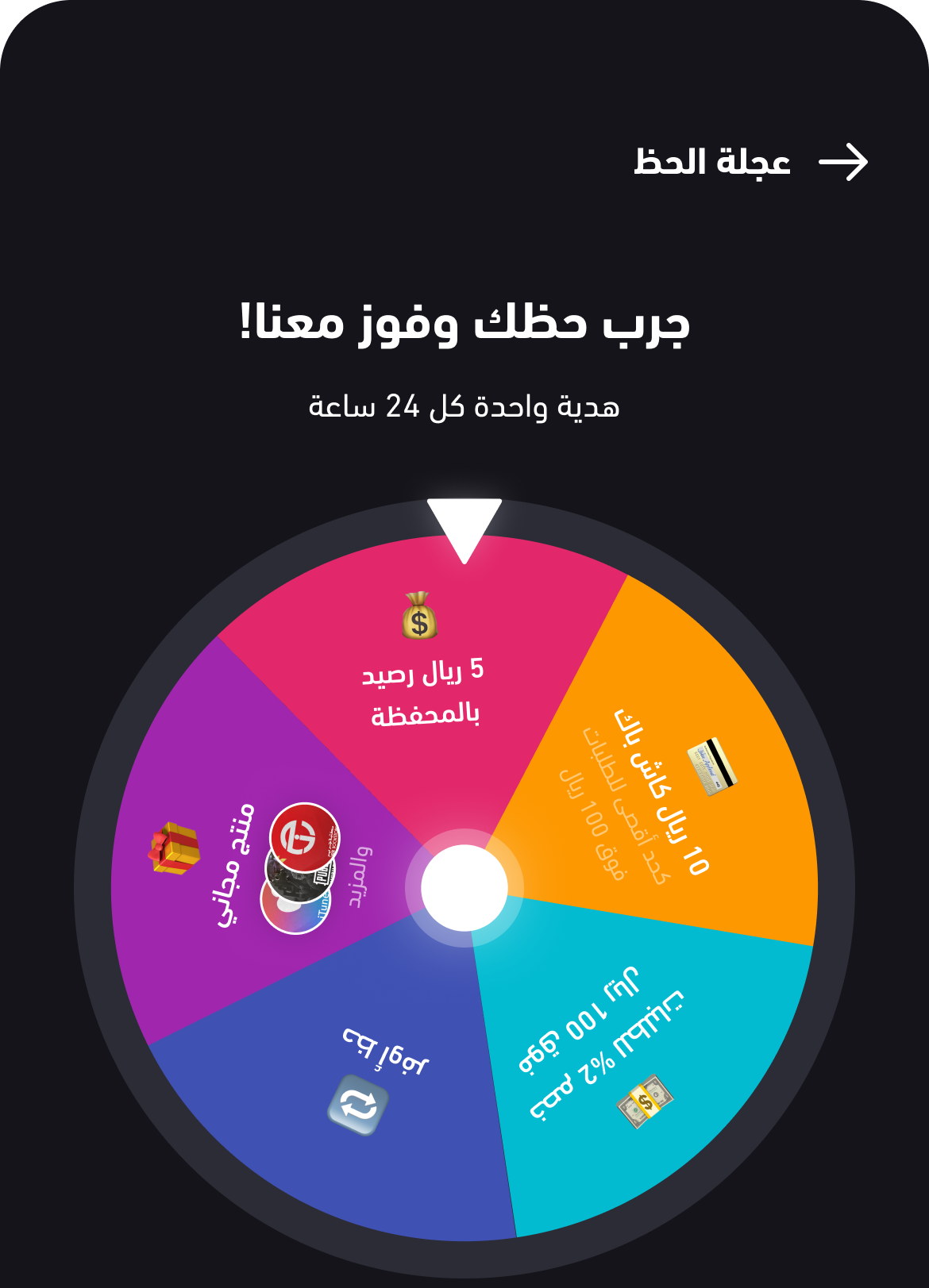
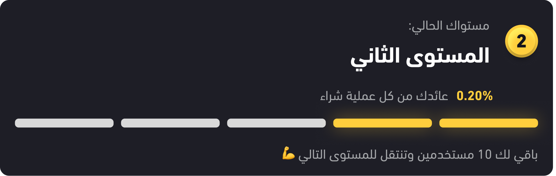
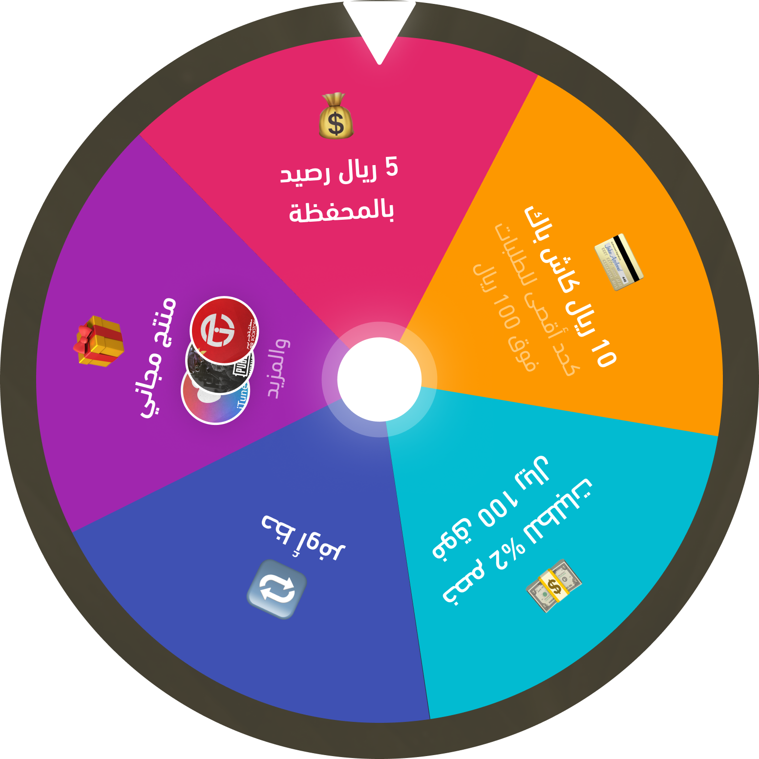
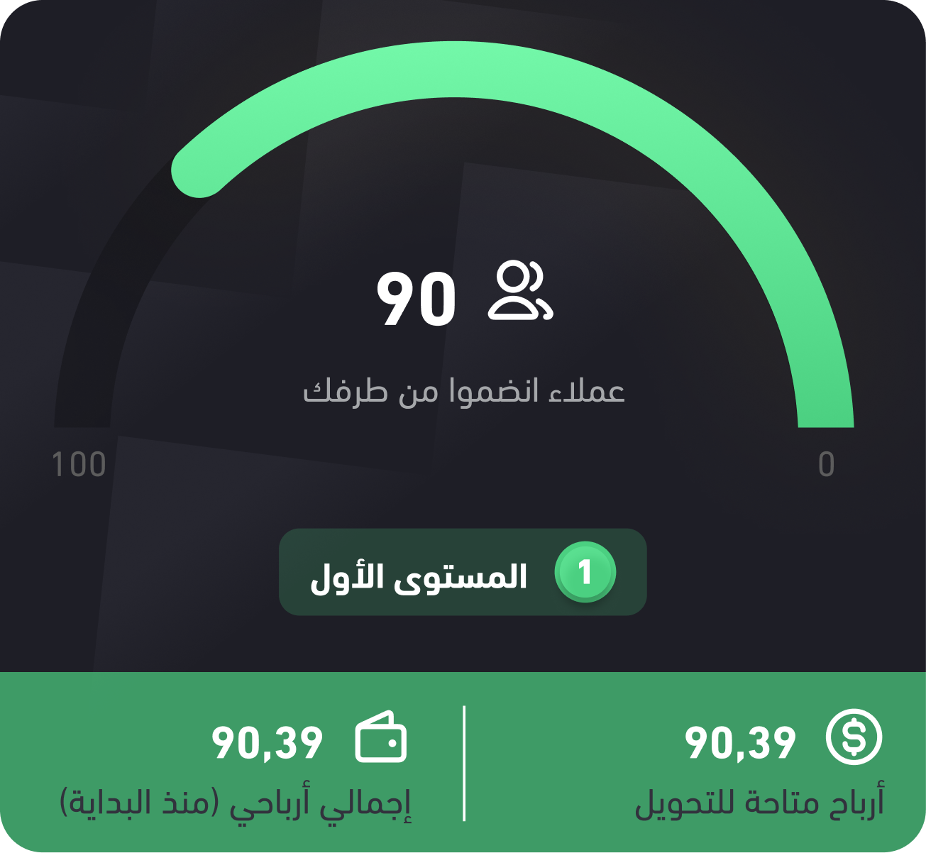
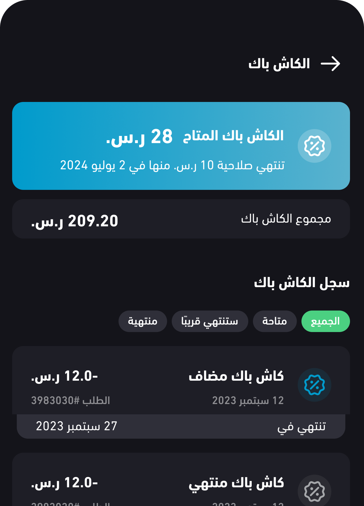
Cashback

Wallet

Wheel of Fortune


#4BD081
#4BD081
#4BD081
#4BD081
#4BD081
#4BD081
DIN Next LT W23
Typeface
Arabic / English


Cashback

Wallet

Wheel of Fortune
The Journey to Scalable Design
Embrace the Challenge
Design Beyond Limits
Uncovering User Needs