Design & Branding
Modernize the platform’s look and ensure a consistent brand identity across all touch points.


Chapter 3
A trusted hub of unique experiences, revamped to tackle challenges and elevate Ish7nha beyond its reputation.

Your Digital World, Unlocked
Simple, easy, and tailored for users ❤️


Designing with users in mind.
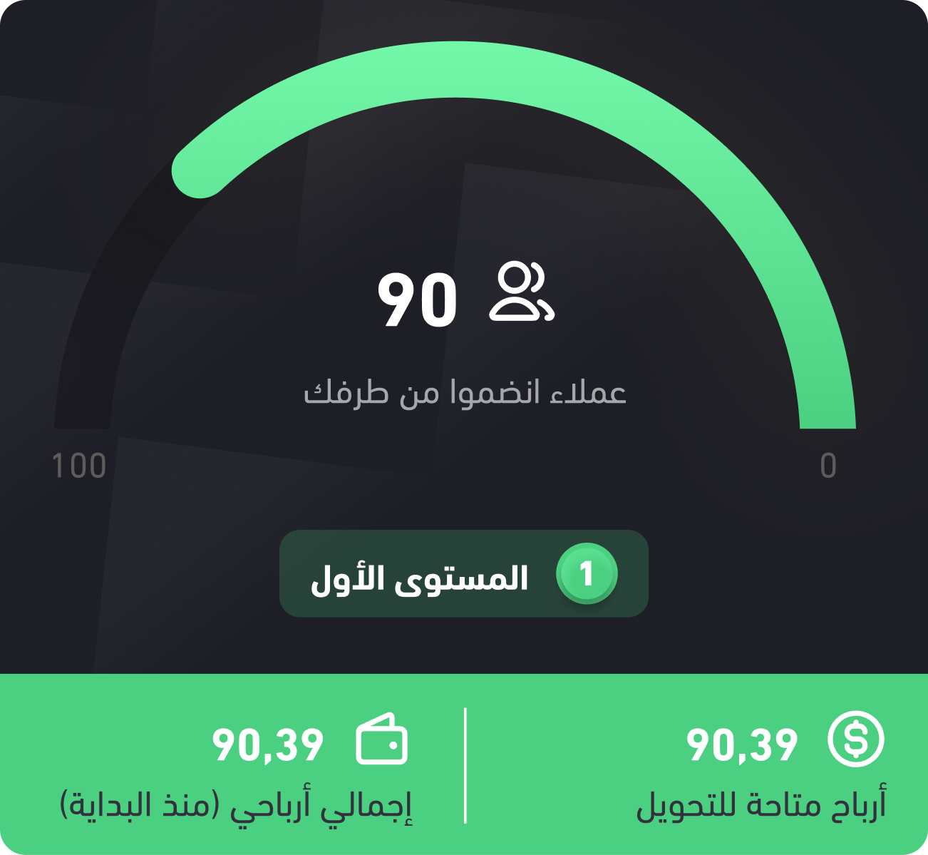
users contributed to this case study.
A Journey that Starts With Story and...
Solo Project
Website → 2024- 2025
App → 2023 - 2024
UX Research
Product Design
UX Writing
Figma
Figjam
Ish7nha was already a trusted, well-regarded store known for unique features competitors lacked. Despite its strong reputation, the platform faced several challenges, which was the focus of my work to address.

Modernize the platform’s look and ensure a consistent brand identity across all touch points.


Simplify the customer experience and optimize the interface for both desktop and mobile.

Prepare the platform for future growth and reduce support requests through intuitive navigation.
Since the platform’s core users weren’t clearly defined in prior usability testing, I focused on structuring the sessions to include and represent these key users.

I asked the user to complete several tasks, such as browsing cards, selecting one, and finalizing a purchase.
Remote moderated usability testing

Screen recordings, think-aloud protocol, post-session questionnaires.

Identify usability issues, bottlenecks, and pain points to improve UX/UI


The usability sessions were truly delightful and gave me a deeper understanding of our users. Several highlights emerged that are worth addressing, either to enhance our overall experience or to make necessary changes.

Making idea creation simple was our hardest task. With the right questions and focused design sessions, we built a flow everyone can use with ease.
100%
1m 20s

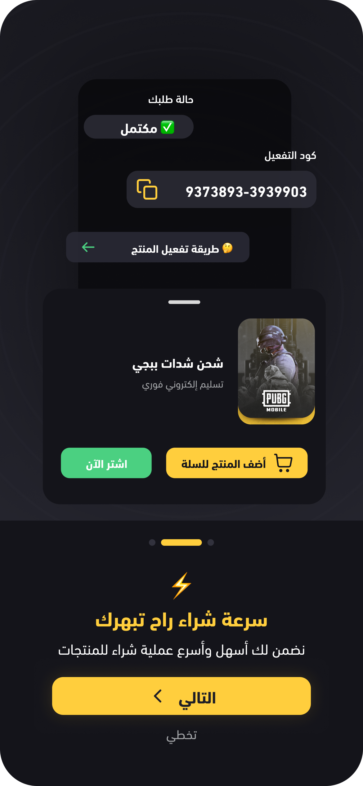
The challenge in the activation process occurred when users tried to locate the activation code; the process breaks at this point, causing users to search for it.
56%
2m 35s

The challenge in choosing cards was that I first asked users to browse the cards freely, then to find a specific card like PUBG or Shein. Since no filtering options existed, users felt overwhelmed, endlessly scrolling up and down without easily locating the card.
96%
2m 2s

Tech-Savvy Gamer🎮
22 years old
University Student
Riyadh, Saudi Arabia
Goals:
Quickly buy game credits (e.g., PlayStation, Xbox, Steam) without visiting physical stores.
Get instant delivery to start playing immediately.
Pain Points:
Long checkout processes that interrupt gaming sessions.
Limited payment options for digital purchases.
Behavior:
Shops mostly on mobile.
Prefers apps with a clean interface and fast transactions.

Busy Professional Gift-Giver🎁
34 years old
Marketing Manager
Jeddah, Saudi Arabia
Goals:
Send digital gift cards (e.g., App Store, Amazon) to friends, family, or clients.
Keep track of purchases and delivery confirmations.
Pain Points:
Unclear steps for sending a gift card.
Poor mobile experience during busy workdays.
Behavior:
Often purchases during short breaks.
Wants personalization options for gifts.

Value-Seeker Parent👨👩👧
46 years old
Accountant
Dammam, Saudi Arabia
Goals:
Buy affordable digital cards for kids’ games and apps.
Ensure secure transactions and reliable codes.
Pain Points:
Difficulty finding the best deals quickly.
Concern about fake or invalid digital codes.
Behavior:
Compares prices before purchasing.
Prefers platforms with clear customer support channels.

Insights 📝
Treasure Hunt Frustration - Users struggle to locate categories, features, or cards
The Endless Scroll - Users need better filtering/search to find what they want
Problem Statement ❌
Users struggle to find categories, filters, and card types, making discovery feel frustrating and time-consuming.
How might we ⁉️
Make navigation and search more intuitive so users can quickly find what they're looking for?
Opportunities 💡
Implement smart filtering by category or brand
Add search suggestions or autocomplete
Highlight popular or recommended cards
Improve search functionality, category visibility, and filtering options

Insights 📝
Users get lost between adding items and completing payment, unsure of next steps or what's required.
Problem Statement ❌
The checkout process feels longer and slower than expected, leading to frustration at a critical moment. Users want quick, confident purchasing without unnecessary steps.
How might we ⁉️
Simplify checkout to make it as fast and seamless as possible while giving users control over their purchase journey?
Opportunities 💡
Provide multiple purchase paths for different user needs
Make product customization visible and accessible upfront
Show clear value proposition at the moment of purchase

Insights 📝
Language and cultural mismatch, forced sign up, and limited country support block exploration and signal from the first moment that the app isn’t built for them, driving early abandonment.
Problem Statement ❌
The onboarding experience creates barriers instead of bridges: users from different cultures don't feel welcomed, forced registration blocks exploration, and limited country support excludes international users all contributing to high abandonment during critical first impressions.
How might we ⁉️
Create an inclusive, low-pressure onboarding experience that welcomes users from any culture, respects their desire to explore first, and supports registration from anywhere in the world?
Opportunities 💡
Make the first experience engaging and culturally relevant
Remove forced commitment during initial experience
Support global users with proper localization

Insights 📝
Users hesitate to purchase due to limited social proof, unclear product usage, and uncertainty about what happens after purchase. Missing guidance, confirmation, and accessible support create anxiety at every decision point.
Problem Statement ❌
Users lack confidence at key moments: they question product quality without validation, feel unsure how to use or activate products, and don’t know if their actions were successful. Complex language and missing feedback amplify uncertainty and slow decision-making.
How might we ⁉️
How might we build confidence across the journey through social proof, clear guidance, simple language, accessible support, and reassuring confirmation at every step?
Opportunities 💡
Provide social proof and usage clarity to build purchase confidence
Create accessible channels for user input and suggestions
Guide users through post-purchase activation process
Confirmation feedback at every interaction point

Insights 📝
Users admire the clean, modern design but struggle with inconsistent visuals, low contrast, and unclear actions. Without a systematic design approach, the interface looks appealing yet becomes difficult to use, especially across devices and diverse user abilities.
Problem Statement ❌
Despite liking the aesthetic, users face confusion from inconsistent buttons and icons, poor contrast, limited responsiveness, excessive colors, and text heavy layouts. These issues reduce clarity and accessibility, turning visual appeal into a usability barrier.
How might we ⁉️
How might we preserve a modern, minimal look while improving consistency, clarity, and accessibility across devices and user abilities through a systematic design approach?
Opportunities 💡
Create systematic consistency for all interactive elements
Improve readability and visual separation
Create focused visual language through intentional color usage
Create universal visual language that transcends language barriers


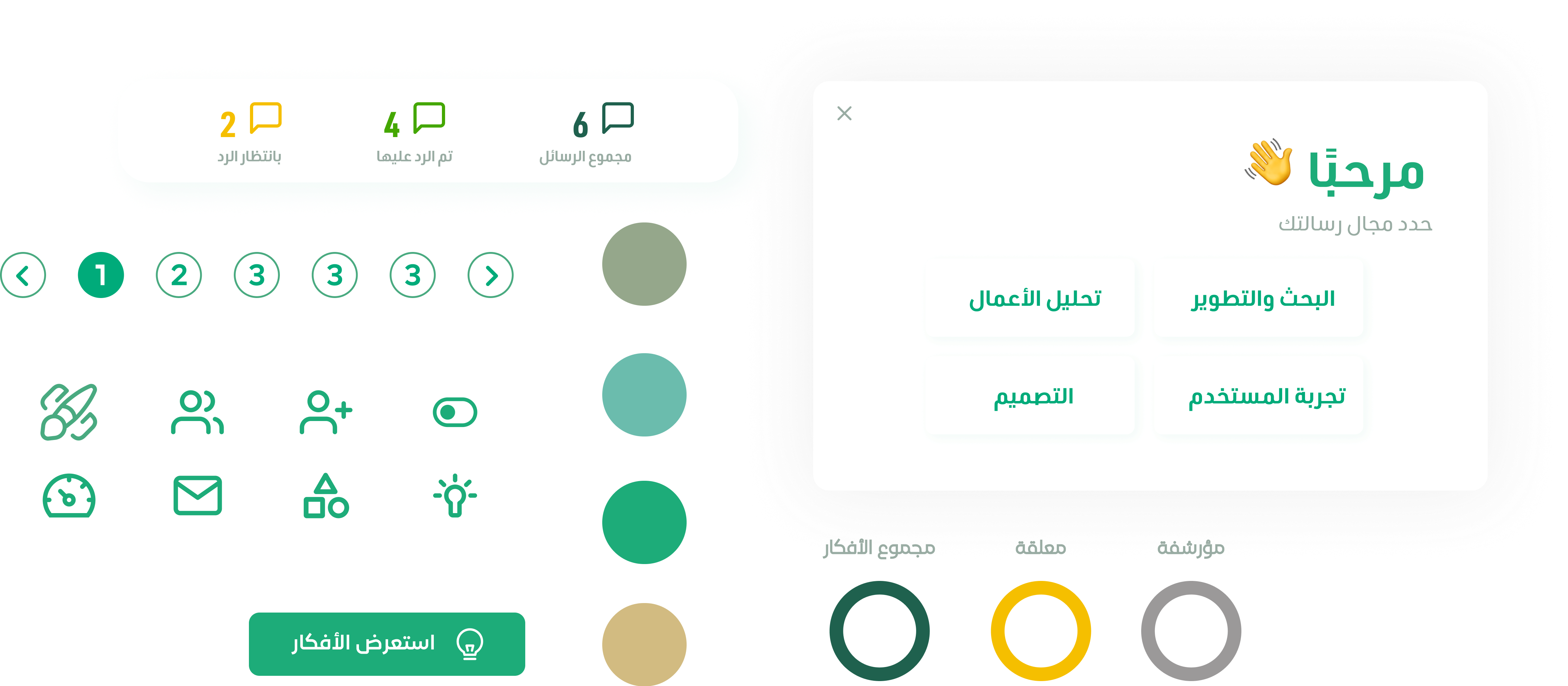
In this phase I was exploring Ideas for each phase thinking what is the best solution that we could Implement? After a Long Journey of research and Insights.
From the opportunities identified, I shared one implemented solution per theme, showcasing user-driven improvements across the platform.
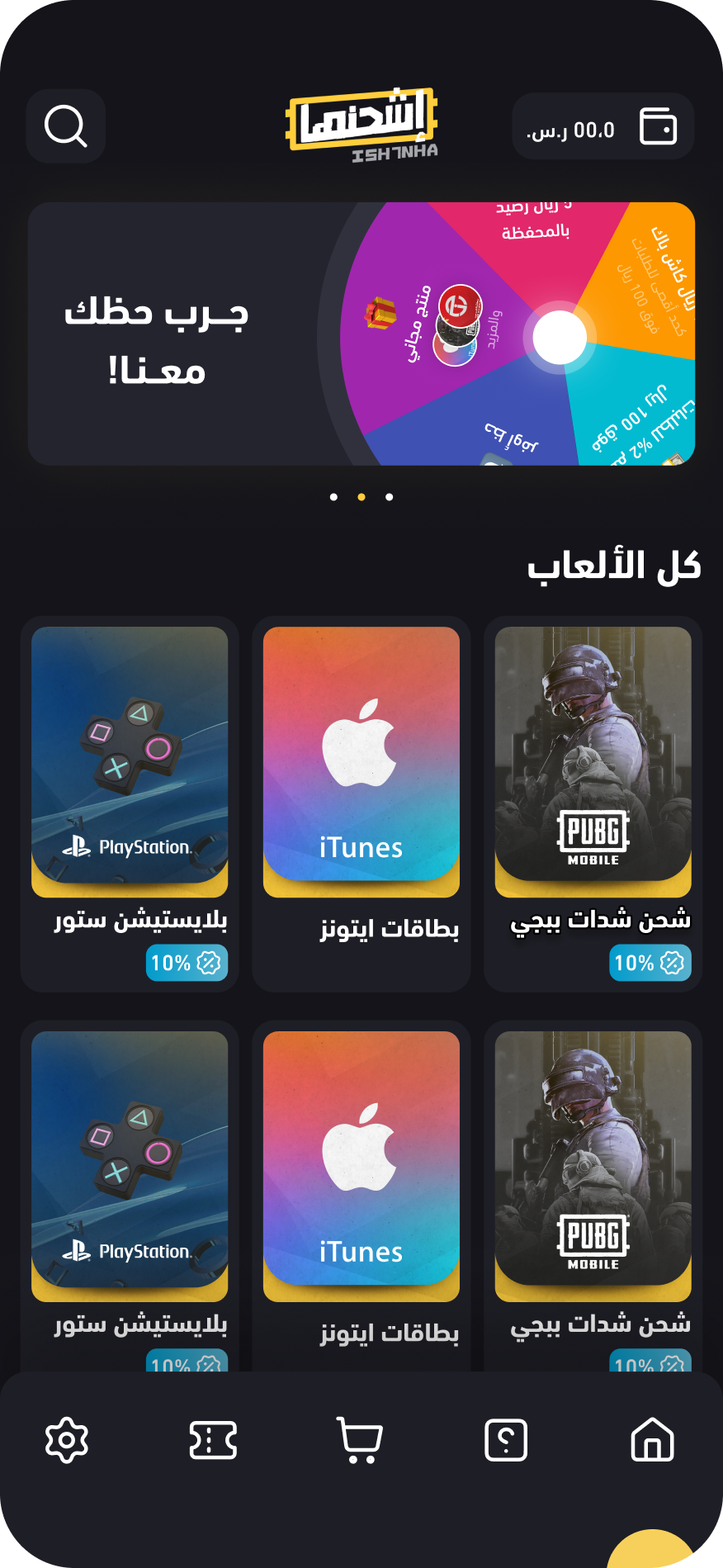
A smart search system with rotating category suggestions that inspire exploration and provide instant navigation to product categories.
Key Advantages
Eliminates blank search anxiety: Users always see where they can go
Reduces decision fatigue: System suggests categories instead of requiring users to remember them
Instant access: One click to any category
Discovery-driven: shows users categories they didn't know existed
Measurable Outcomes
38% of users click rotating suggestions to explore new categories
Navigation time reduced from 45s to 12s for suggested categories
Category discovery increased by 52% (users finding categories they didn't search for)
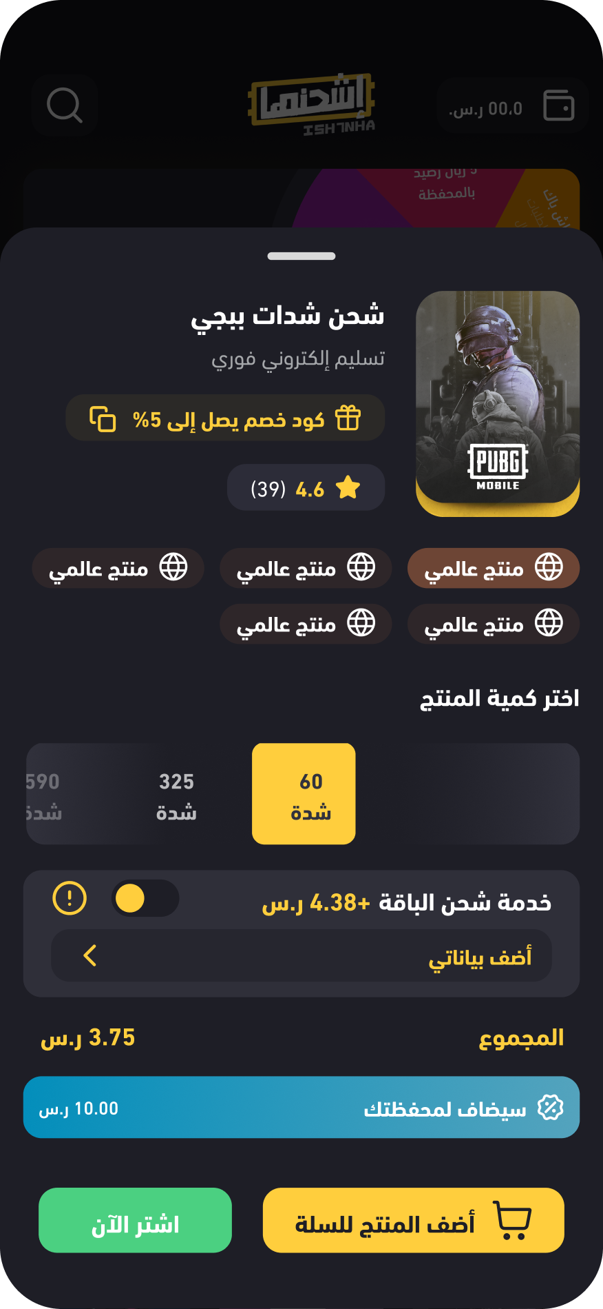
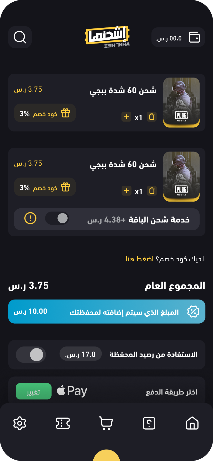
Added a "Buy Now" button alongside the traditional "Add to Cart" button, giving users two distinct purchase paths based on their intent.
Key Advantages
Reduces steps for decisive buyers: From 4 clicks to 1 click to reach checkout
Maintains flexibility: Comparison shoppers can still use cart
Matches user intent: Fast path for urgent purchases, browsing path for explorers
Measurable Outcomes
Buy Now button adoption rate: 60% of single-item purchases use this path
Time to checkout reduced: 80 seconds → 30 seconds for Buy Now users
Cart abandonment: Decreased by 23% (users who wanted fast checkout no longer abandon)
Conversion rate: Increased by 18% for impulse purchases
An enjoyable, guided onboarding flow that introduces main features using UX language that resonates with the user's culture and local context.
Key Advantages
Reduces confusion: Clear feature introduction sets proper expectations
Builds trust: Speaking user's language (literally and culturally) creates comfort
Increases engagement: Enjoyable experience encourages completion
Lowers abandonment: Users understand value before being asked to commit
Measurable Outcomes
Onboarding completion rate: 49% → 84%
First-session engagement: Increased by 41% (users who complete onboarding are more likely to browse/purchase)
Language-specific satisfaction for Arabic users: 5.2/10 → 8.9/10
Added "User Feedback" and "How to Use" sections at the bottom of product detail pages, giving users the validation and clarity they need before purchasing.
Key Advantages
Peer validation: Real user reviews reduce purchase anxiety
Transparency: Star distribution shows honest, balanced feedback
Usage clarity: "How to Use" eliminates "I don't know how to use this" fear
Risk reduction: Users feel informed and prepared before buying
Measurable Outcomes
Purchase conversion rate: Increased by 24% for products with 10+ reviews
Time spent on product page: +32% (users reading reviews and usage guides)
Post-purchase support tickets: Reduced by 41% (users reference "How to Use" section)
A comprehensive, consistent design system for all buttons and icons across the entire app, ensuring users always know what's interactive and what to expect.
Key Advantages
Eliminates confusion: Users always recognize interactive elements
Predictable behavior: Consistent patterns reduce cognitive load
Faster task completion: Clear hierarchy guides users to primary actions
Accessibility: Labels ensure screen readers work correctly
Measurable Outcomes
Task completion speed: +28% (users identify correct actions faster)
Accidental clicks: -64% (clear hierarchy prevents mistakes)
User confidence: +35% ("I always know what to click")
Accessibility score: 68% → 89% (icon labels improve screen reader support)

The question was clear to us, and we began by addressing the internal issues with straightforward, user-driven solutions.

 Show the Journey
Clear progress indicators and status updates so users always know where they are and what's next
 Intentional Visibility
Strategic use of contrast, color, and hierarchy to guide attention while maintaining modern aesthetics

An innovation Center created to Awqaf employees
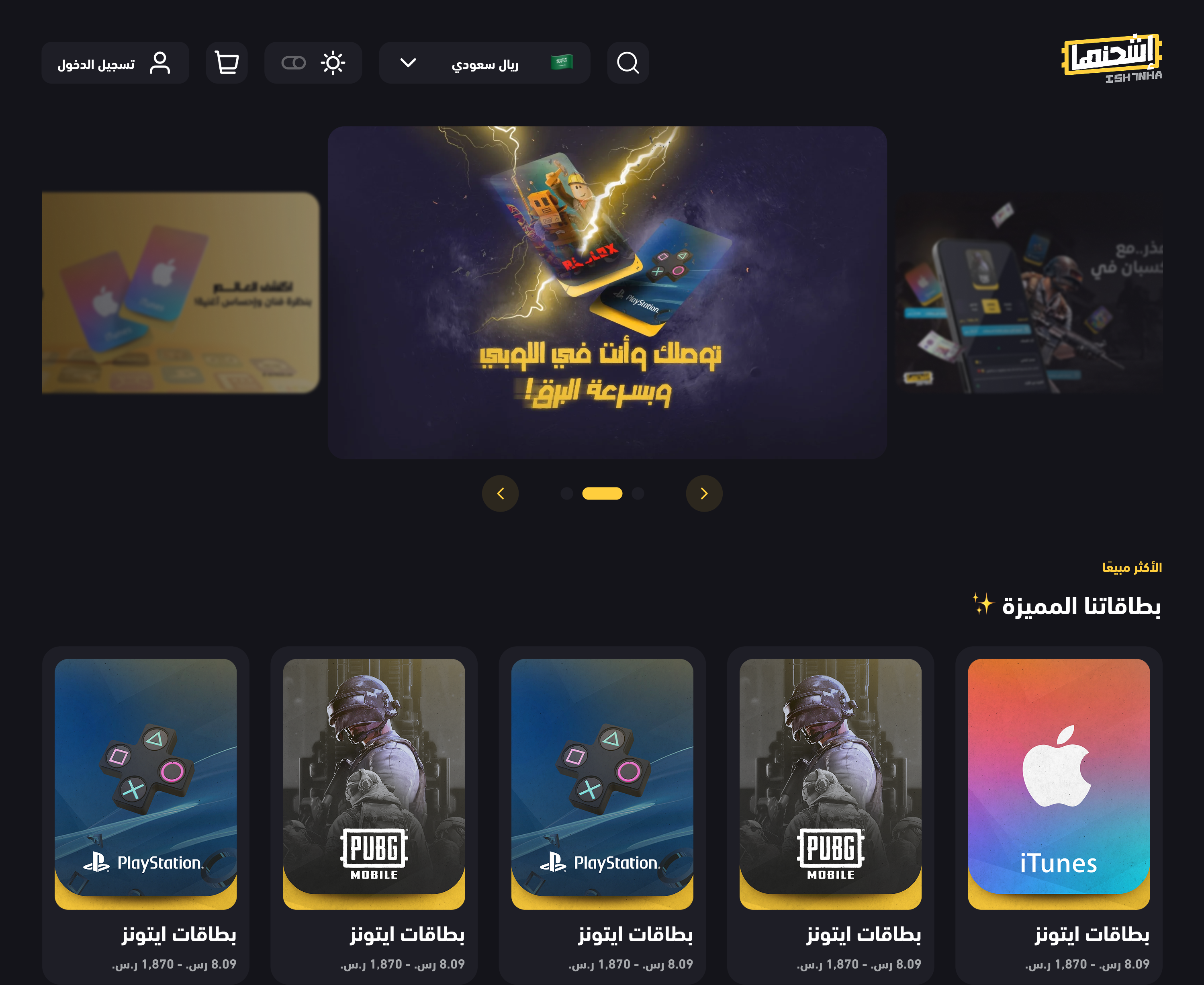
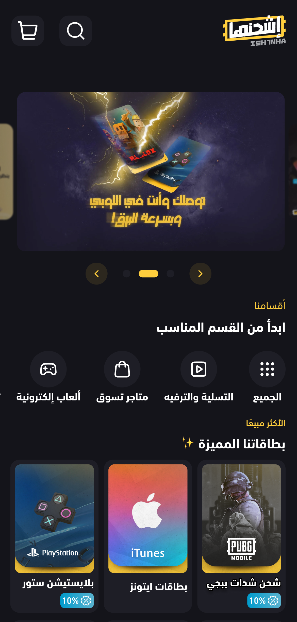
Here’s the new version of Ish7nha, with an improved experience across Desktop, Mobile Web, and App. The design ensures consistency across platforms while providing a seamless and enjoyable user experience.
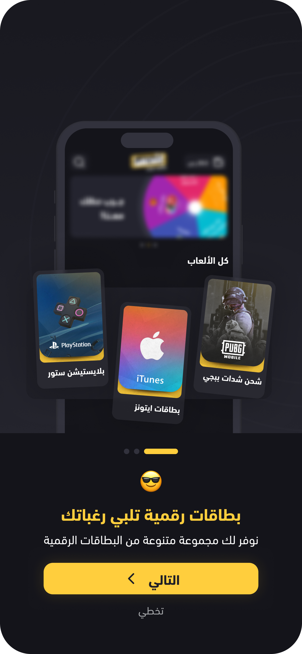
In designing the onboarding, I focused on three core elements: creating a simple and enjoyable experience, using clear language tailored to the target audience, and highlighting the main features.
Designing the Application was the first phase, Plenty of UI Designs Added later in the Web/ Mobile Home page, but the experience is having the same seamless and enjoyable experience
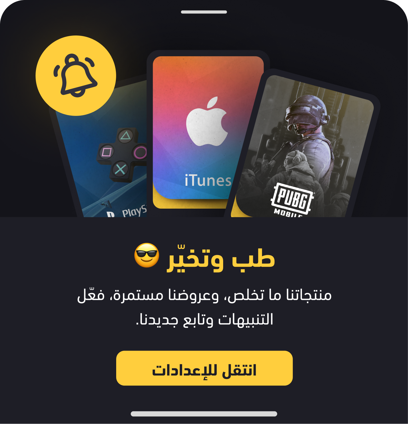
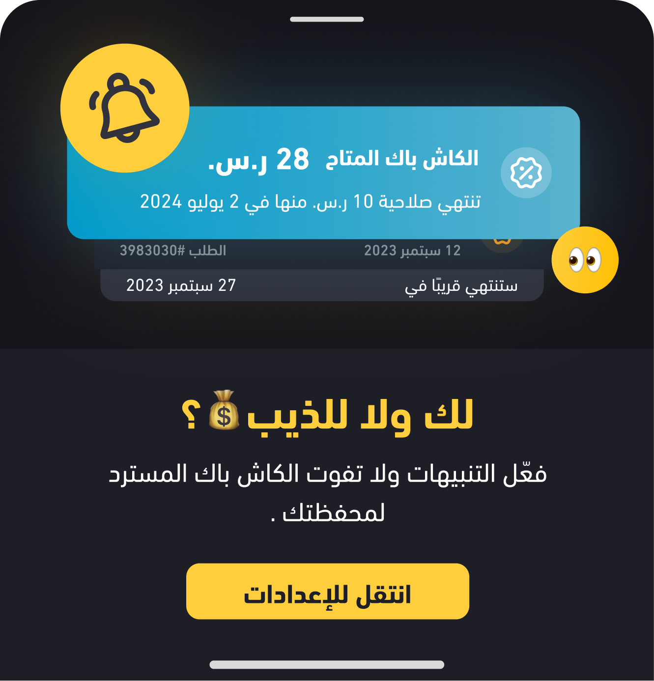
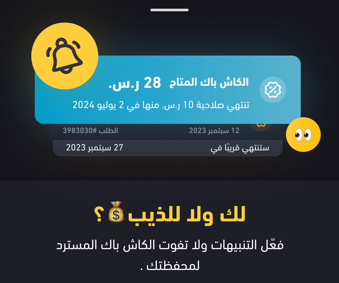
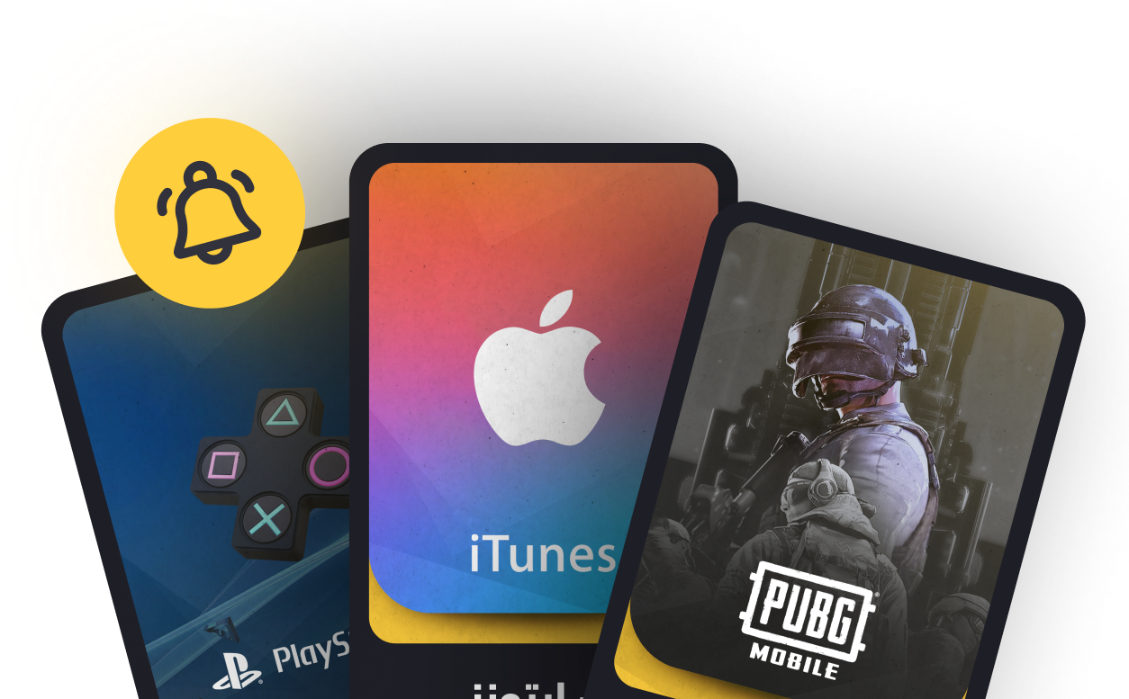
I consider notifications a critical engagement touchpoint, especially for apps that require ongoing interaction. As a result, I designed notification reminders with an engaging and thoughtful UI.

In addition to the revamp, Ish7nha introduced new features across the app and web/mobile experiences. I focused on ensuring these features genuinely helped users and were presented clearly and intuitively.

62% of parents said the wallet made buying for children simpler and faster.
35% expressed that they felt more in control of spending for their kids.
A notable insight was the demand for the wallet feature, driven largely by parents making purchases for their children.
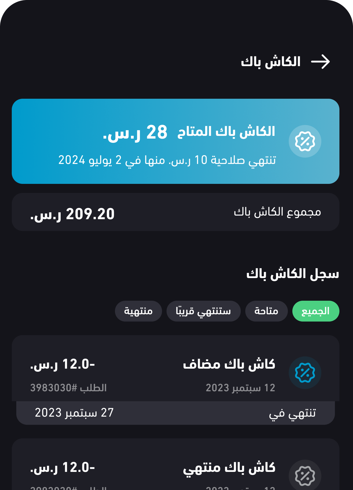
63% of users stated that Cashback would increase their likelihood of repeat use.
58% of users continued using cashback after 2 weeks, indicating sustained value.
Cashback consistently emerged as a top user request, leading us to question how, and how much it would genuinely benefit users.
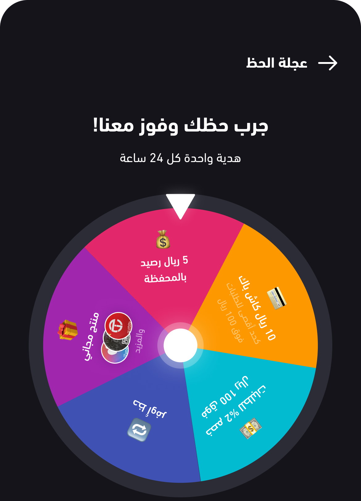
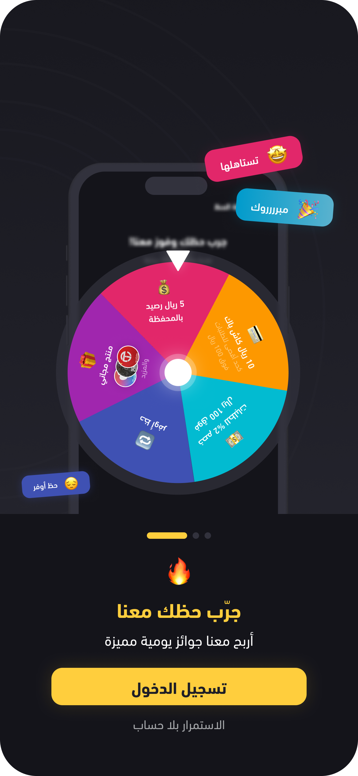
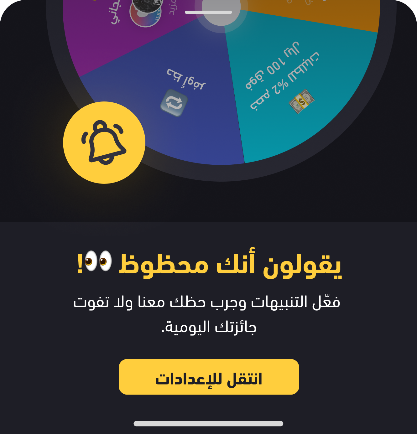
Repeat Visits: Users who spun the wheel returned 28% more frequently over the following day.
Interaction Rate: 74% of users engaged with the wheel at least once in their first session.
The Fortune Wheel added a sense of fun and reward to the app experience. Users found it motivating and enjoyable, transforming routine interactions into playful moments that encouraged continued engagement and higher retention.
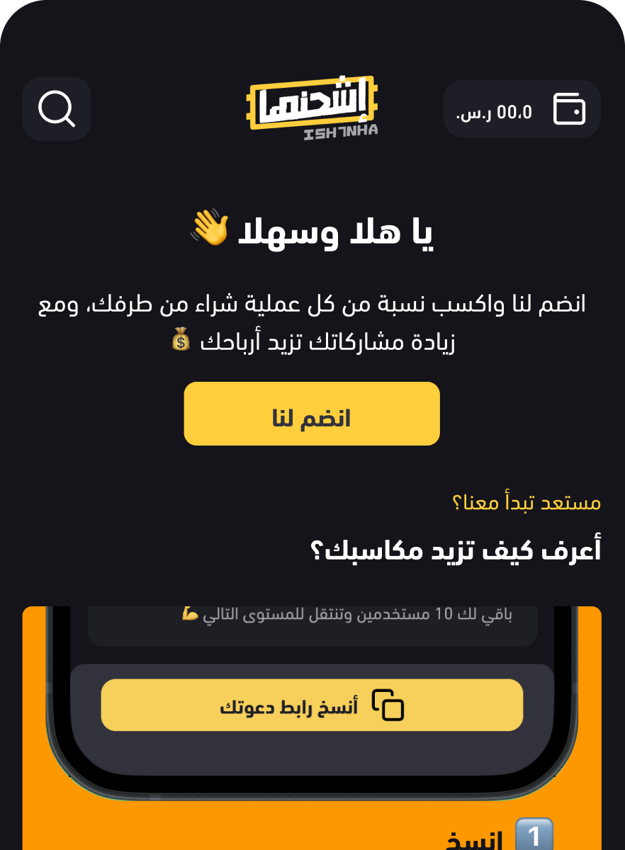

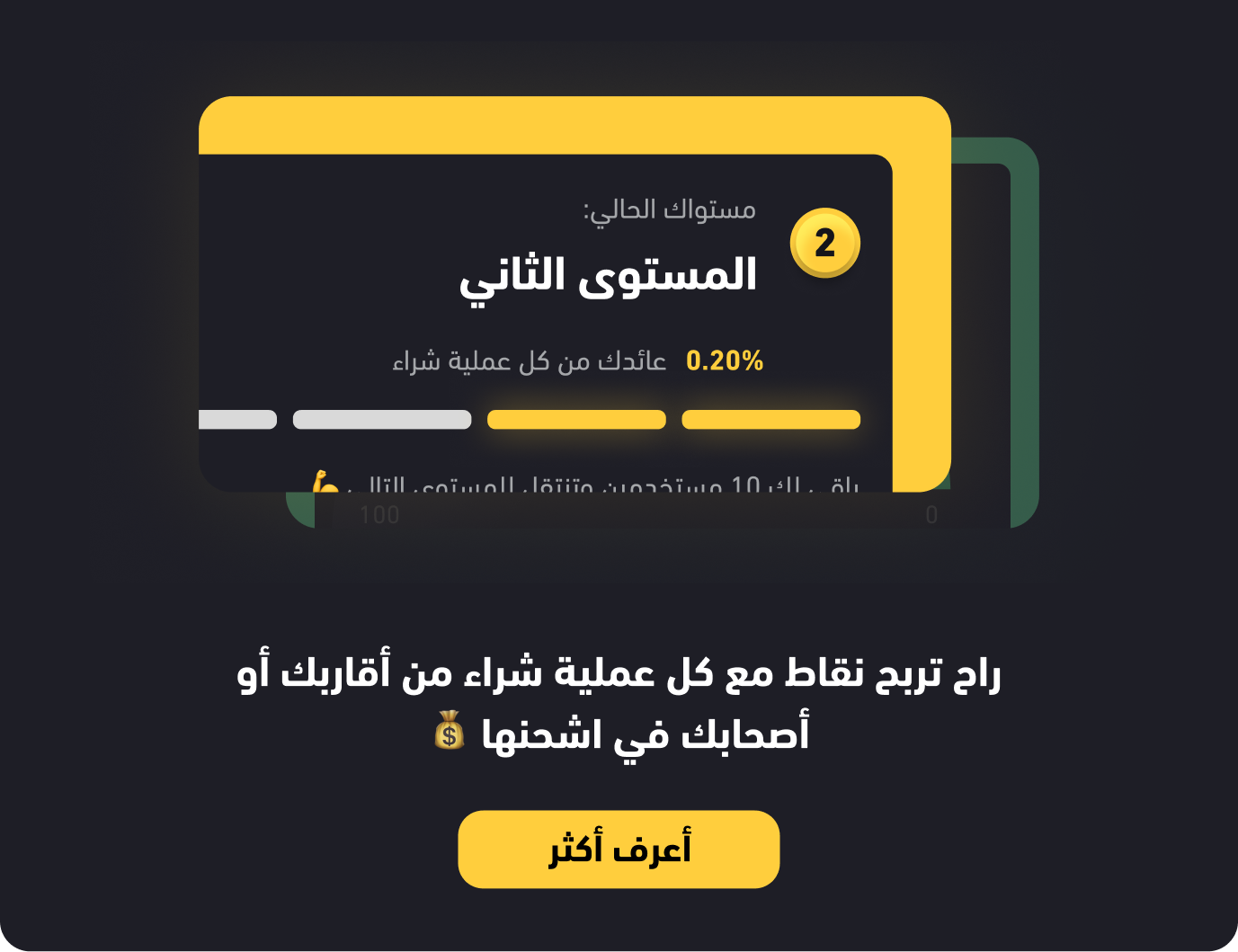
The referral system was a key area where we noticed strong user interest, they were already referring the platform naturally. Offering rewards for these referrals turned it into a game-changer.
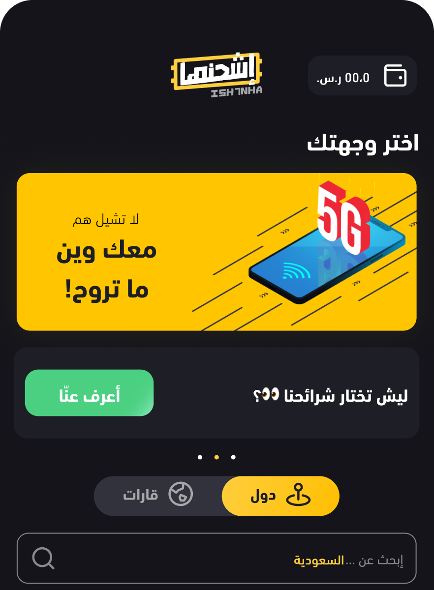
The eSIM feature goes beyond the store’s digital cards, offering users exciting new capabilities while supporting the expansion of the business.
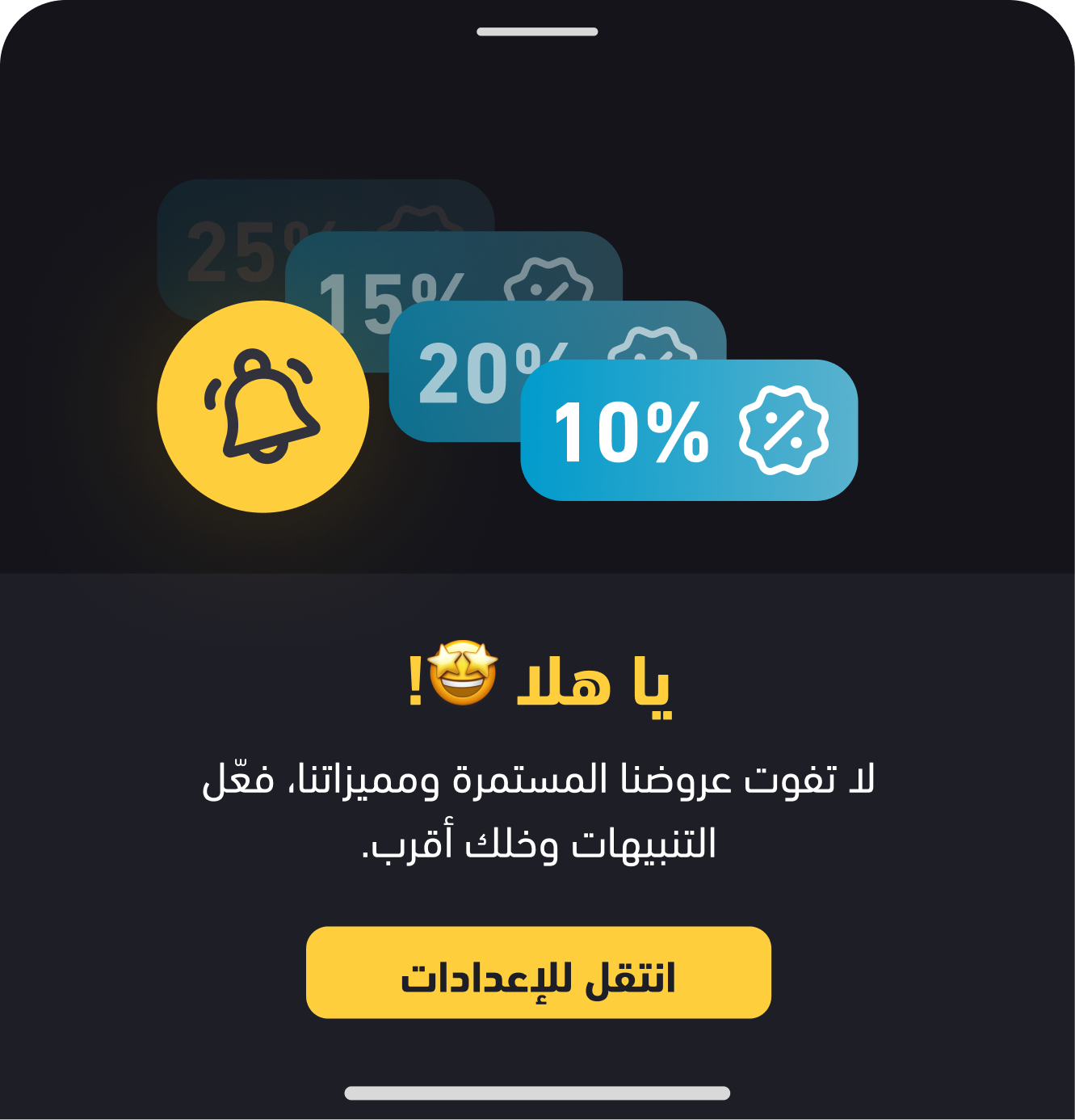
We aimed to boost engagement through the app by providing consistent reminders about the app and cashback offers, which successfully increased user activity.


The road had its challenges, but I’m sharing the Cards I earned in the project here to inspire your journey.

The Journey to Scalable Design

Embrace the Challenge

Design Beyond Limits

Uncovering User Needs