Product Manager
41 years old
Tech Fluency: High
Berlin, Germany
🎯 Goals:
Automate onboarding and reduce support tickets
Train chatbot on product documentation
Monitor unanswered questions, improve over time
❌ Pain Points:
Frustrated with lack of analytics or control
Wants version history of knowledge base sync
Seeks compliance clarity (GDPR, data privacy)
🧩 Needs:
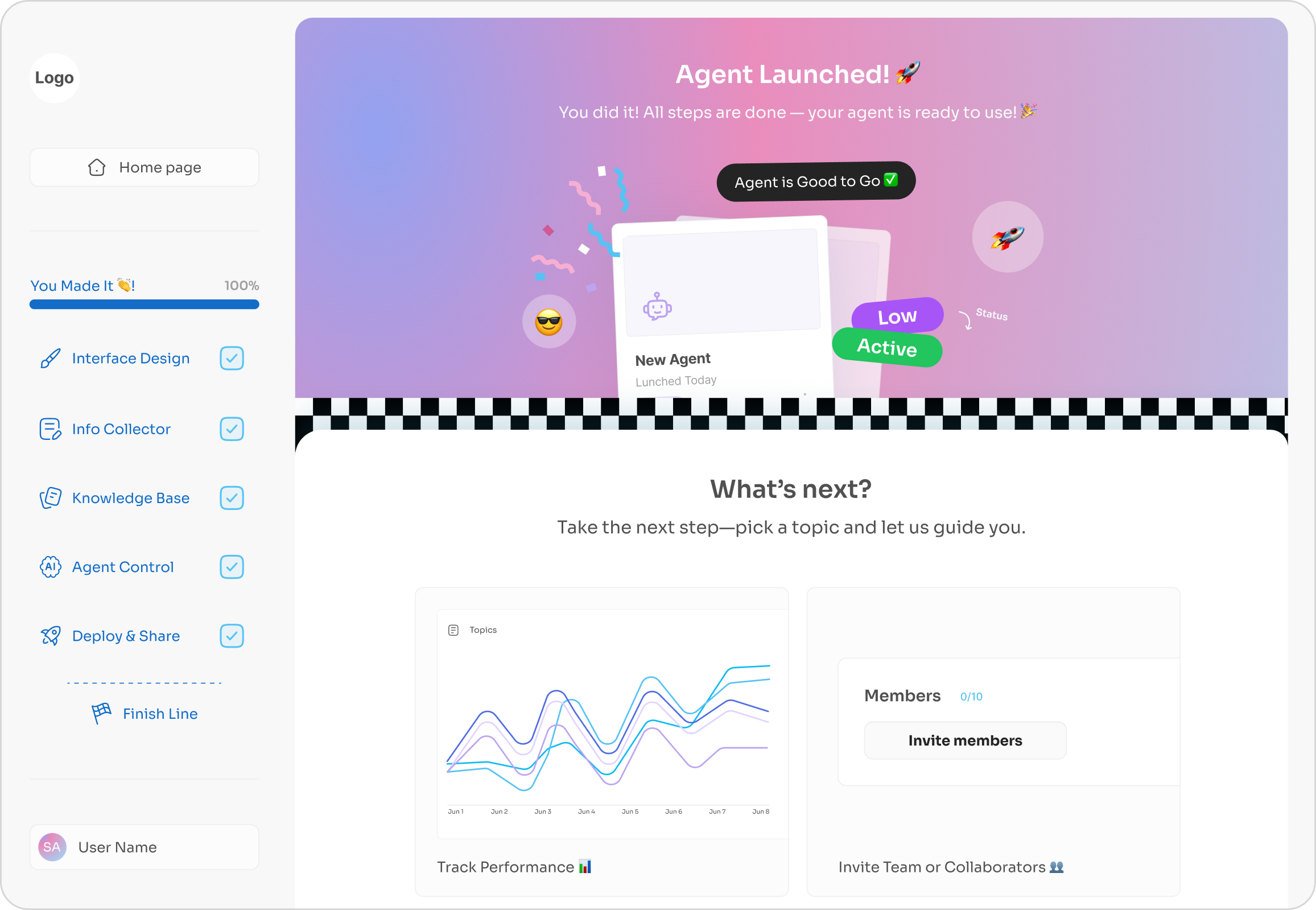
Bot performance insights (charts, query logs)
Integration with internal docs & analytics tools
Admin controls and bot versioning


Founder of an EdTech startup
34 years old
Tech Fluency: Low to Moderate
Dubai, UAE
🎯 Goals:
Automate internal support and employee onboarding.
Maintain accurate, up-to-date responses by training the chatbot on internal documents and monitoring unanswered questions.
Provide 24/7 access to company knowledge and policies.
❌ Pain Points:
Difficulty setting up bots without technical skills.
Lack of content control, approval workflows, and version tracking.
Concerns around security, access permissions, and compliance.
🧩 Needs:
A simple onboarding setup (wizard-style) to upload and configure knowledge sources..
Pre-built templates for common use cases like FAQs or course assistants.
Clear pricing explanation and support content.

Developer
27 years old
Tech Fluency: Advance
Riyadh, Saudi Arabia
🎯 Goals:
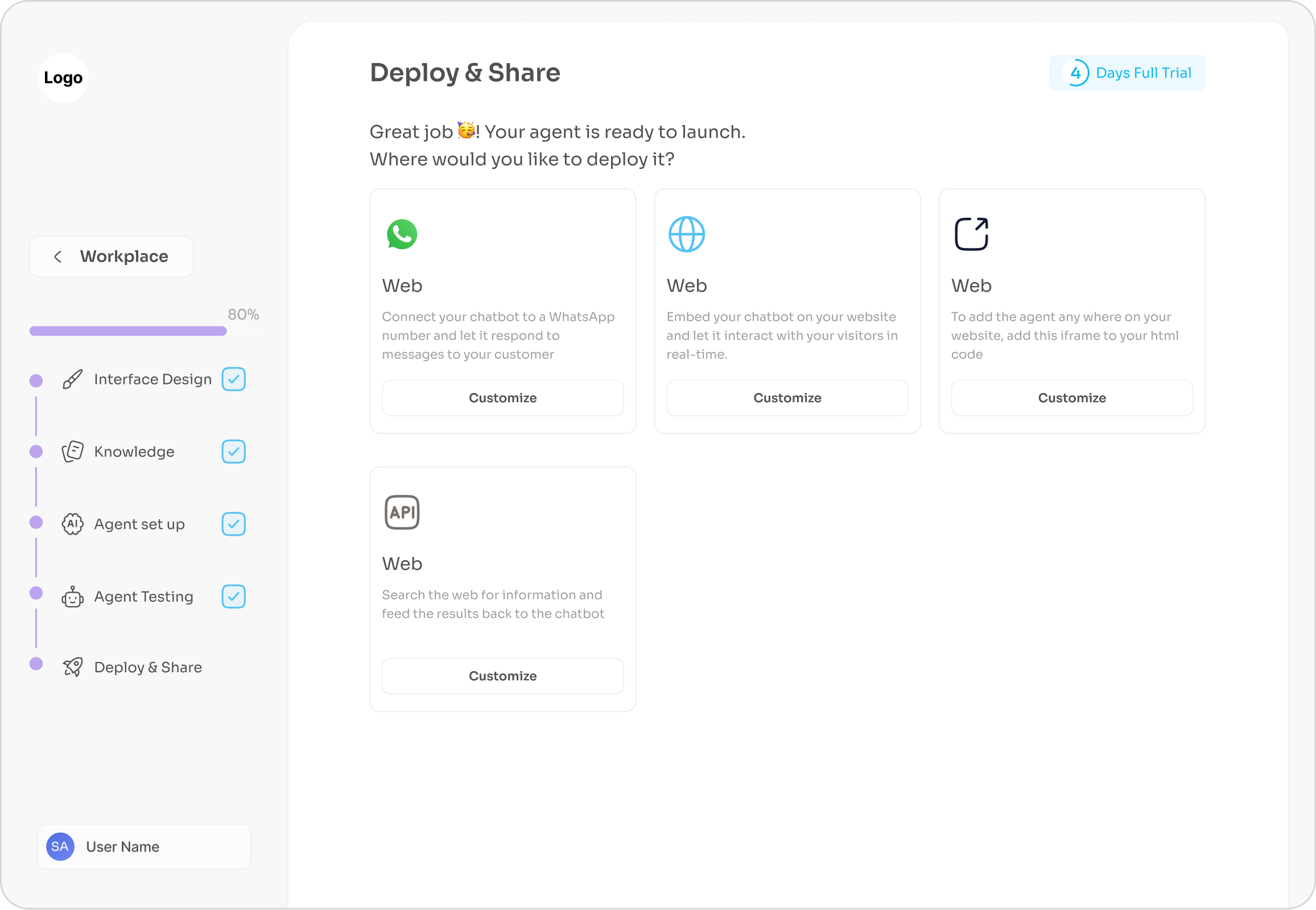
Embed bots into Webflow, WordPress, or React apps
Offer AI chatbot as a value-add to his services
Monitor unanswered questions, improve over time
❌ Pain Points:
Frustrated with lack of analytics or control
Wants version history of knowledge base sync
Seeks compliance clarity (GDPR, data privacy)
🧩 Needs:
Easy-to-use API access and clear docs
Manage multiple chat bots for different clients
Simple way to customize embed code
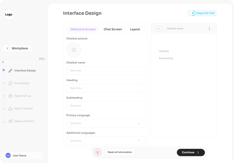
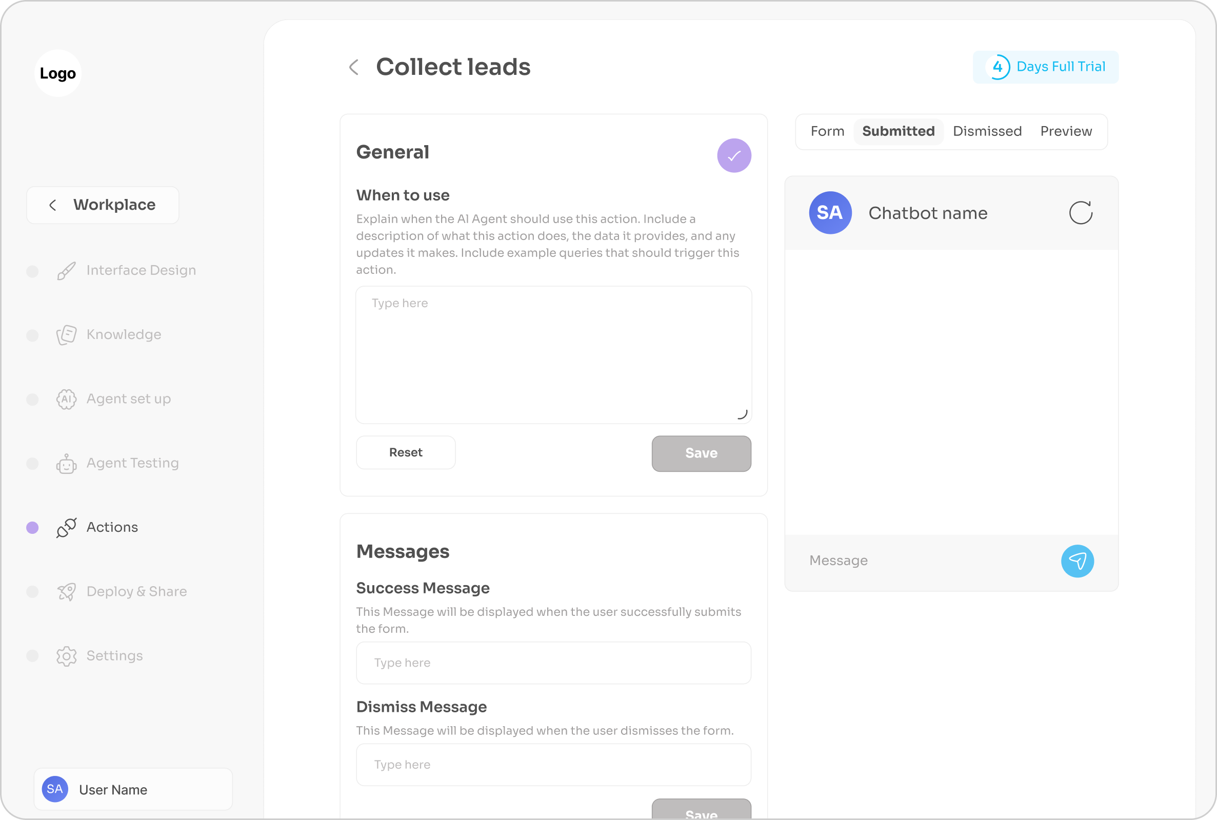
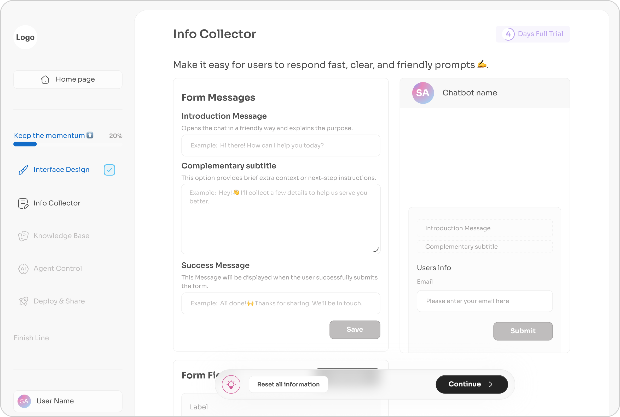
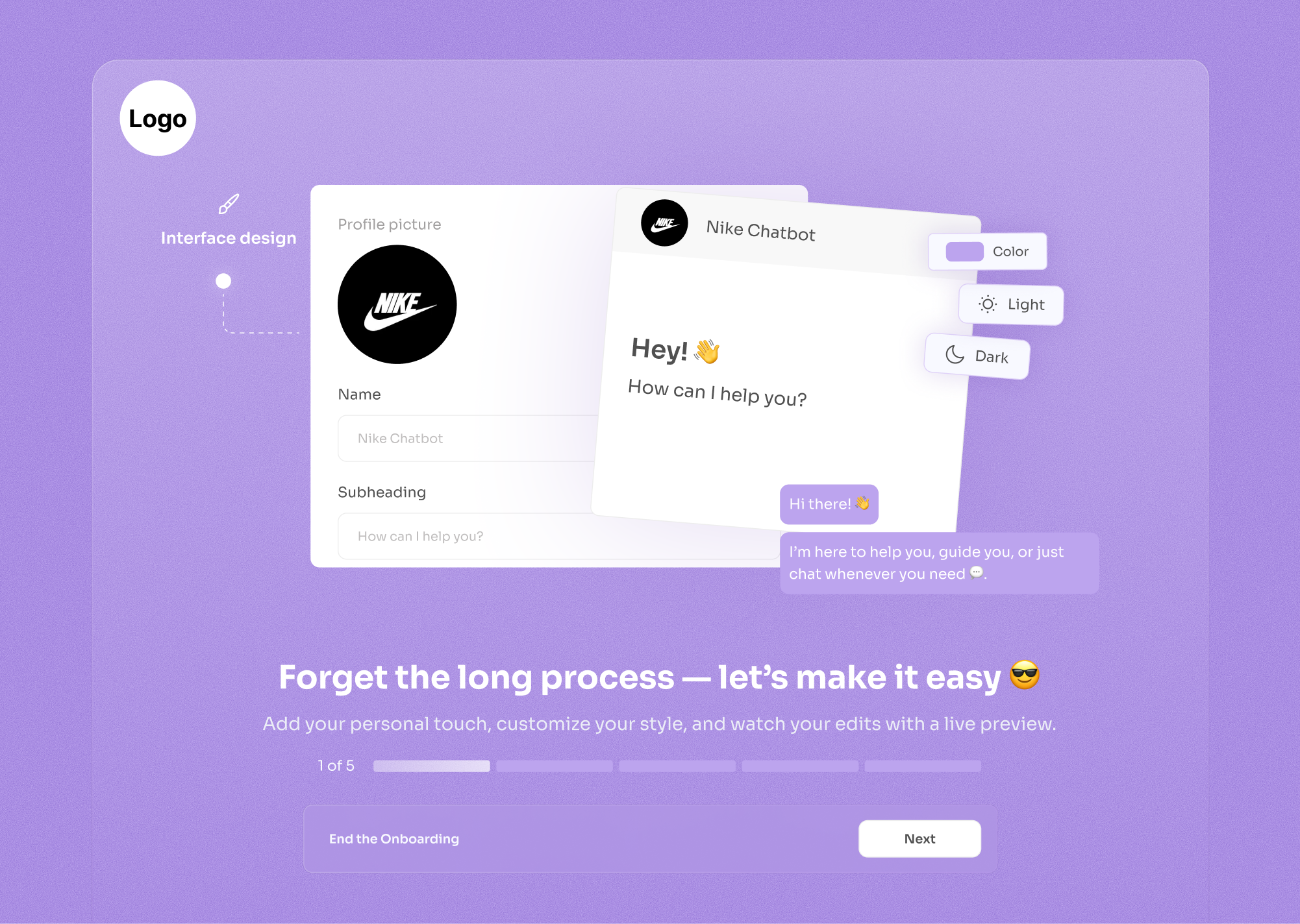
Users feel they have infinite control even within your structured system. The "Type here" placeholders guide them, but they feel creative freedom. It's controlled chaos that always produces good results.
Every edit shows immediately in the preview. Dopamine hit from "I changed something → I see it now" keeps users engaged and exploring features they might otherwise ignore.
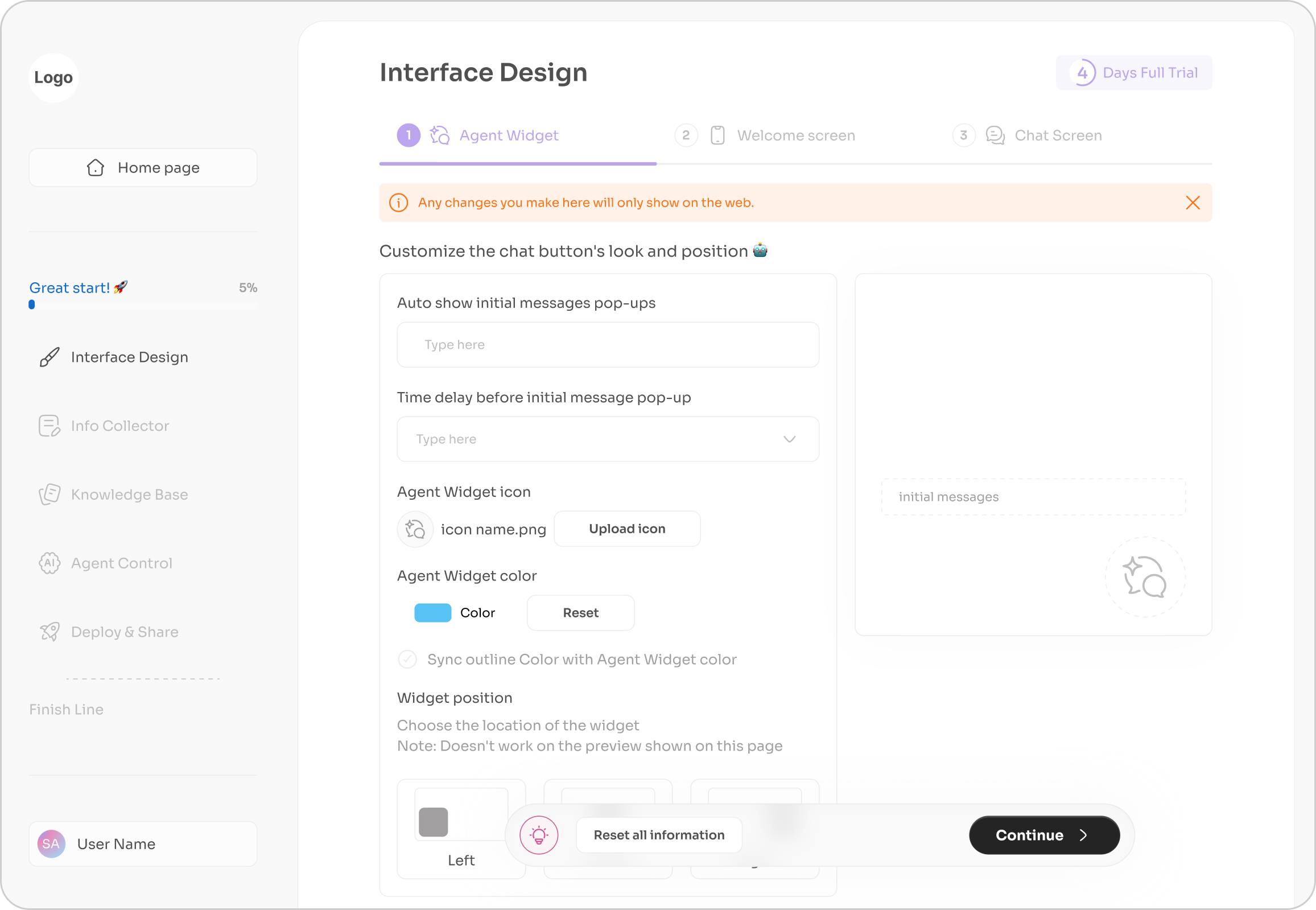
"Reset all information" button with palette icon screams "don't worry, you can't permanently break this." Users experiment more when they know mistakes are reversible.
The interface mimics what users expect from design tools (Canva, Figma). Upload image icon, color pickers, text fields: all familiar patterns that require zero learning curve.
While most platforms force fixed designs or developer-heavy customization, we enable brand-perfect chat styling in minutes, no CSS involved.
When users customize appearance, they're emotionally invested. "I built this" creates stickiness, they're less likely to churn because the chatbot feels uniquely theirs, not a generic template.
Left side = controls, right side = real-time preview. Users see results immediately, eliminating the anxiety of "what will this look like?" The feedback loop is instant: change color → see it → love it or change again.
Simple: Upload picture, type name (basics)
Medium: Customize heading/subheading (messaging)
Advanced: Fine-tune button colors, outlines, themes (precision)
Warning Banner sets expectations immediately. transparency prevents disappointment.
Use emojis as casual teaching, it's friendly instructions, not intimidating forms.
Smart default for users who want consistency but don't want to set both colors manually. Reduces decisions for simple cases, still allows override for advanced users.
Top tabs show steps, users know this is step 1 of 3, reducing overwhelm.
Without customization, users might delay launch waiting for "the right look." With it, they launch in the same session, visual polish happens during setup, not as a blocker.
Customization feels premium. Even if backend AI is identical to competitors, "I made this look exactly like my brand" creates perception of higher value, justifying the pricing.
Free tier could have limited customization (2 colors only), paid tier unlocks full palette. Users who care about branding will upgrade immediately.


For Matla', I served as the Founder, Brand Strategist, Art Director, and Product Design Lead, taking the product from concept to launch.
I defined the product vision, built the brand strategy and visual identity, and designed the end-to-end user experience. I also led the content strategy, publishing plan, and creative direction across social media, creating a consistent brand experience at every touchpoint.
The journey is structured in four stages:
This case study follows the journey from Problem → Strategy → Design → Launch, highlighting the key decisions, design process, and strategic thinking behind building Matla as both a product and a brand.
Hope you enjoy the journey ✈️
Scope
Brand Strategy • Product Discovery • Product Strategy • Product Design • Art Direction • Content Strategy • Content Publishing
Timeline
2026 – Present
Team
2 Team Members
Every week, designers open countless tabs searching for something worth learning; a case study, an article, a podcast, or a new tool. After hours of searching, they often leave with more bookmarks than knowledge.
The challenge isn't a lack of resources. It's knowing which ones are actually worth the time.
Matla' was created to solve that.
Instead of asking designers to search through an endless sea of content, Matla curates high-quality UX and product design resources into a simple Arabic-first experience. Every recommendation is carefully selected to help designers spend less time searching and more time learning.
The challenge was turning that vision into a product grounded in real user needs rather than assumptions. Questions around target users, key pain points, and the MVP needed to be answered before any design decisions could be made.
The project began with research to reduce uncertainty and establish a strong product direction.

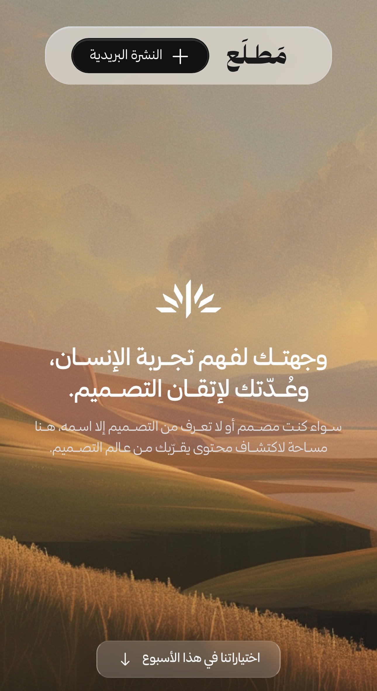
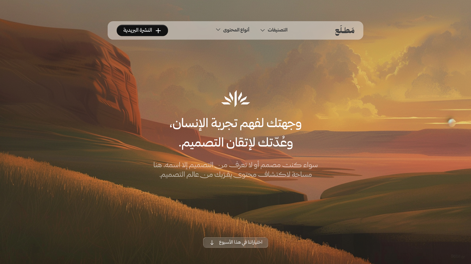
The name Matla' comes from the Arabic word مَطلَع, meaning the beginning or emergence of something. It represents the start of a designer's learning journey؛ a place where curiosity turns into discovery and knowledge becomes a continuous practice.
This idea became the foundation of the brand. The sun was chosen as Matla's core symbol, representing new beginnings, clarity, guidance, and the pursuit of knowledge.
Every element of the identity was intentionally designed to reflect a learning experience that feels approachable, thoughtful, and inspiring.The challenge isn't a lack of resources. It's knowing which ones are actually worth the time.